Taraki - Job hunting and networking platform
Taraki - Job hunting and networking platform
About Taraki
Taraki is an online marketplace for blue and white collar job seekers and hiring managers in Pakistan. It aims to empower job seekers by connecting them with tailored opportunities and provide employers with vetted candidates.
To comply with my non-disclosure agreement, I have omitted confidential information in this case study.
MY ROLE
TIMELINE
2 phases, 3 months each
MY PROCESS
TLDR ⬇️
I completely revamped and restructured Taraki's job-seeking mobile application and employer portal. Challenges the startup faced included: less downloads, low user retention, engagement and a frustrating user experience.
I conducted UX Strategy sessions, ideation along with affinity mapping, user journey mapping, wireframing and moved on to high-fidelity design and definition of a scalable design system. We conducted A/B tests to verify our design choices and reiterated. Finally we conducted usability tests and incorporated most of the valuable feedback.
A glimpse of the impact of my efforts in collaboration with the team:
01. Problem Identification
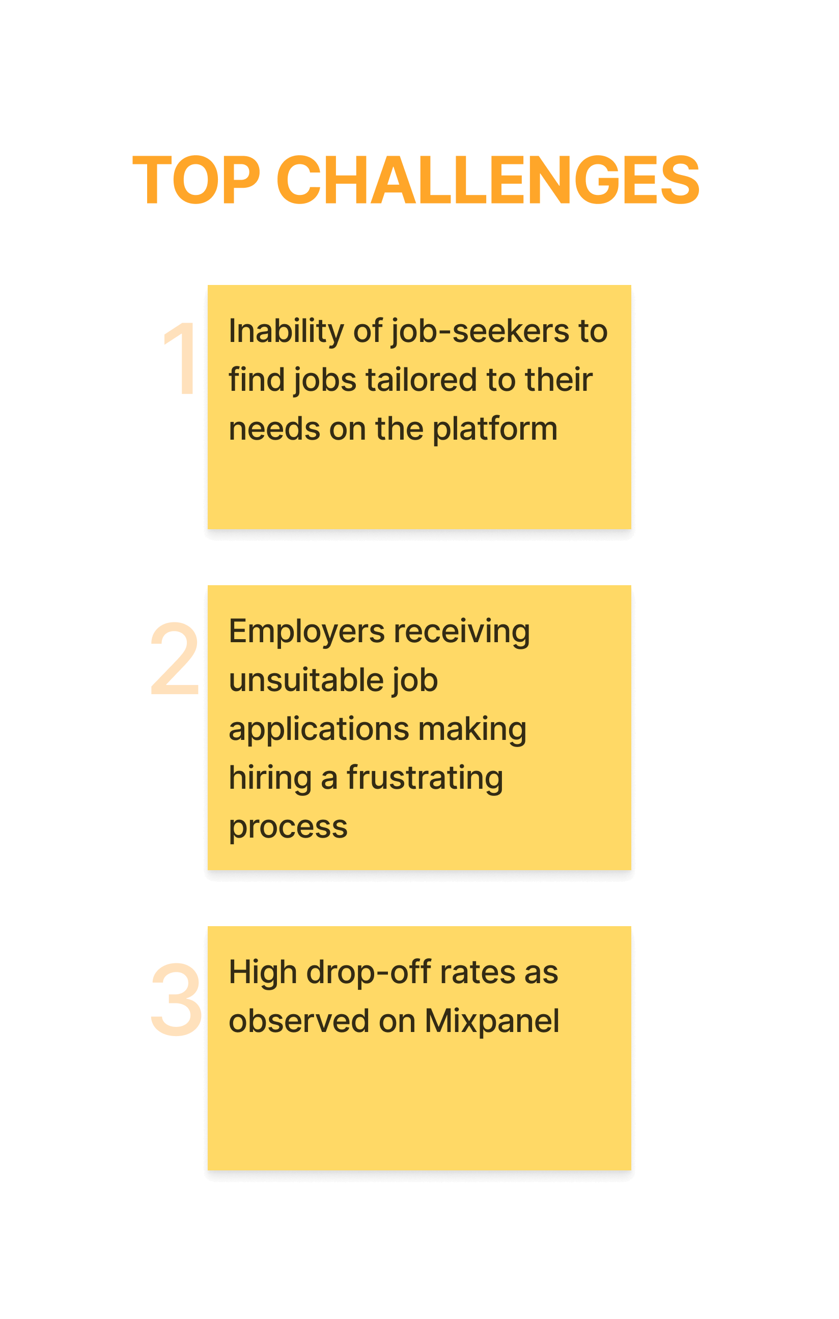
Taraki previously had a basic MVP version of a mobile application with no defined design system and a poor user experience. Although the number of downloads was high, there has been low user engagement and retention as many users started complaining about poor user experience.
Hence, there was a dire need to review and improve the overall experience.
How might we..
restructure and redesign Taraki’s job-seeker and employer-facing products in order to increase users, engagement, retention and their satisfaction?
Another outcome was for me to help Taraki set up their in-house design team.
02. Process Definition
To start off, I defined ways of working with the team. The purpose of defining a workflow was to get the team’s buy-in and work in a streamlined manner.
I designed a workflow to work with different teams, including product, business development, technology, marketing and customer service. The workflow included every interaction, activities (internal and external) and process of working on iterations following an Agile Methodology. This workflow contained discussion points, outcomes and participants of each touchpoint along with approximate duration.
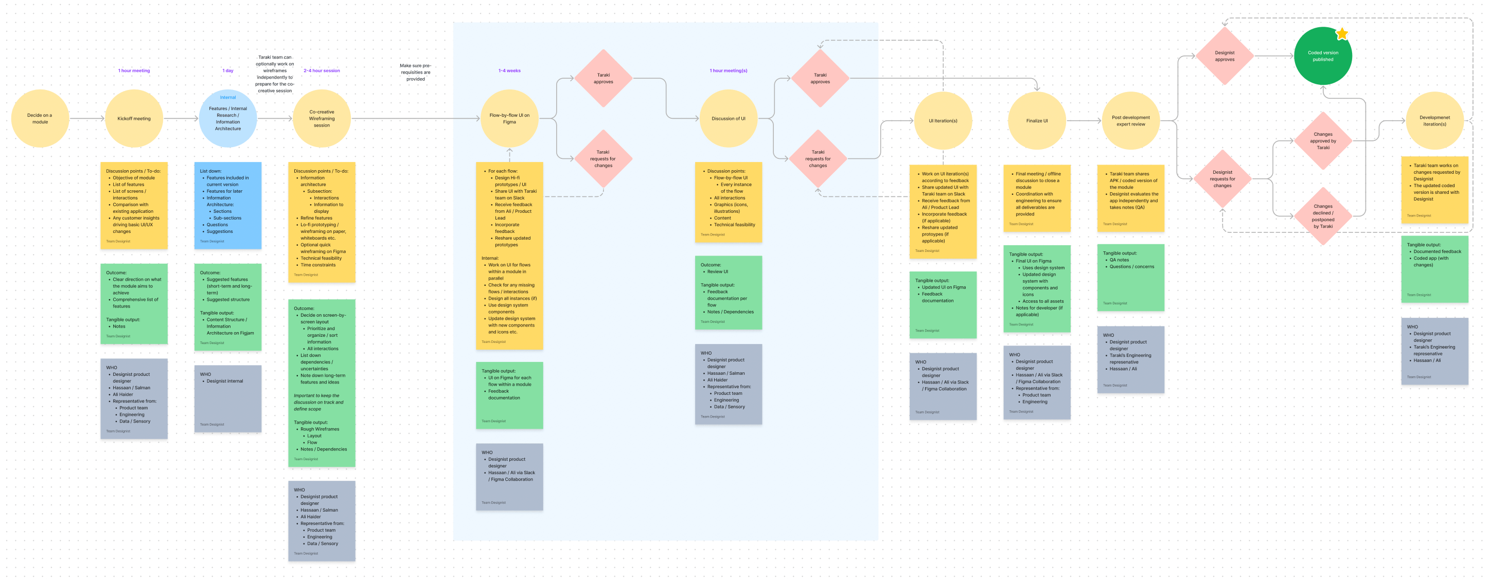
User Flow Diagram I designed outlining the process the team should follow
03. Knowledge Map
After conducting meetings with the team, I created an initial Knowledge Map. This consisted of:
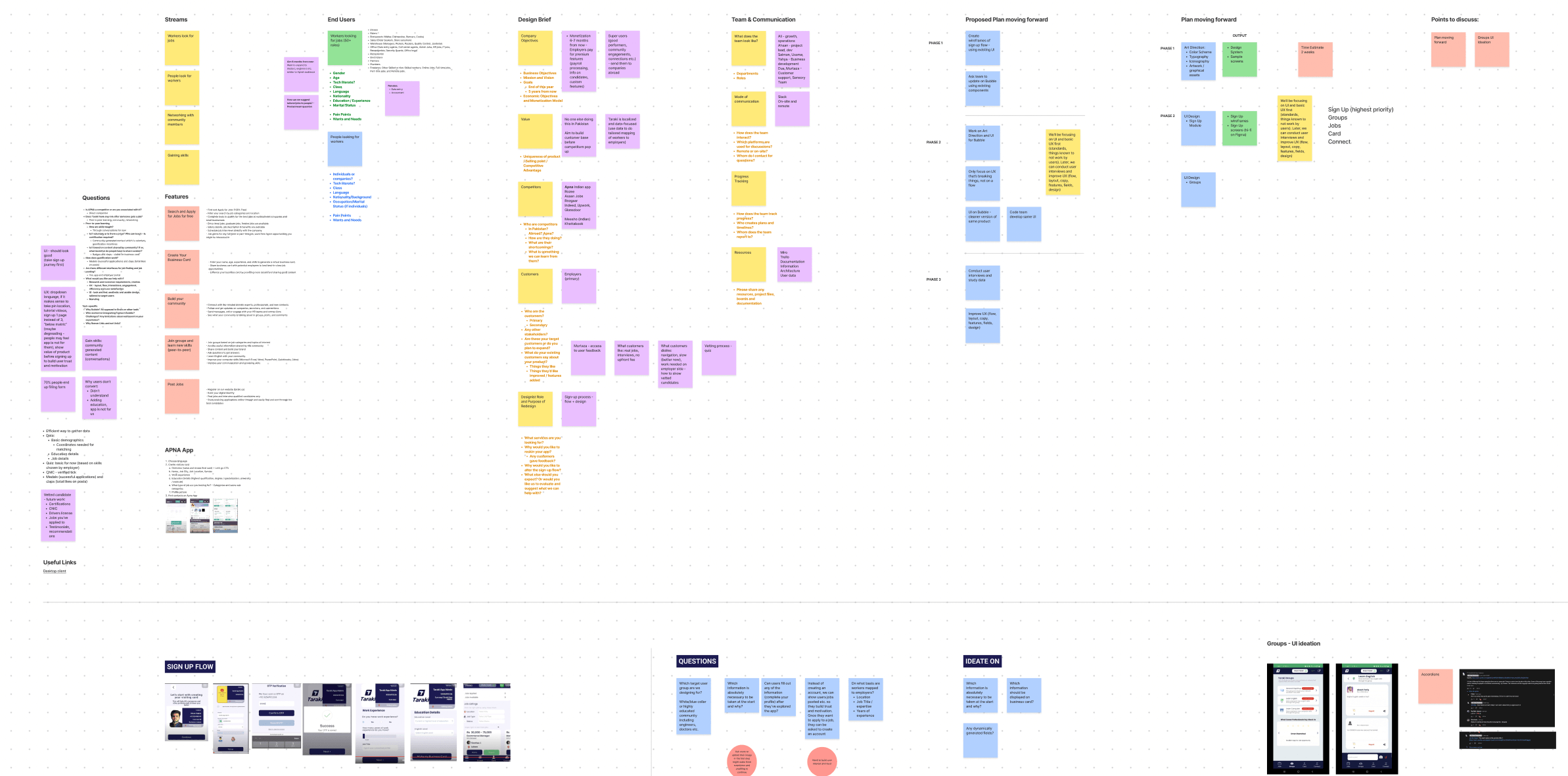
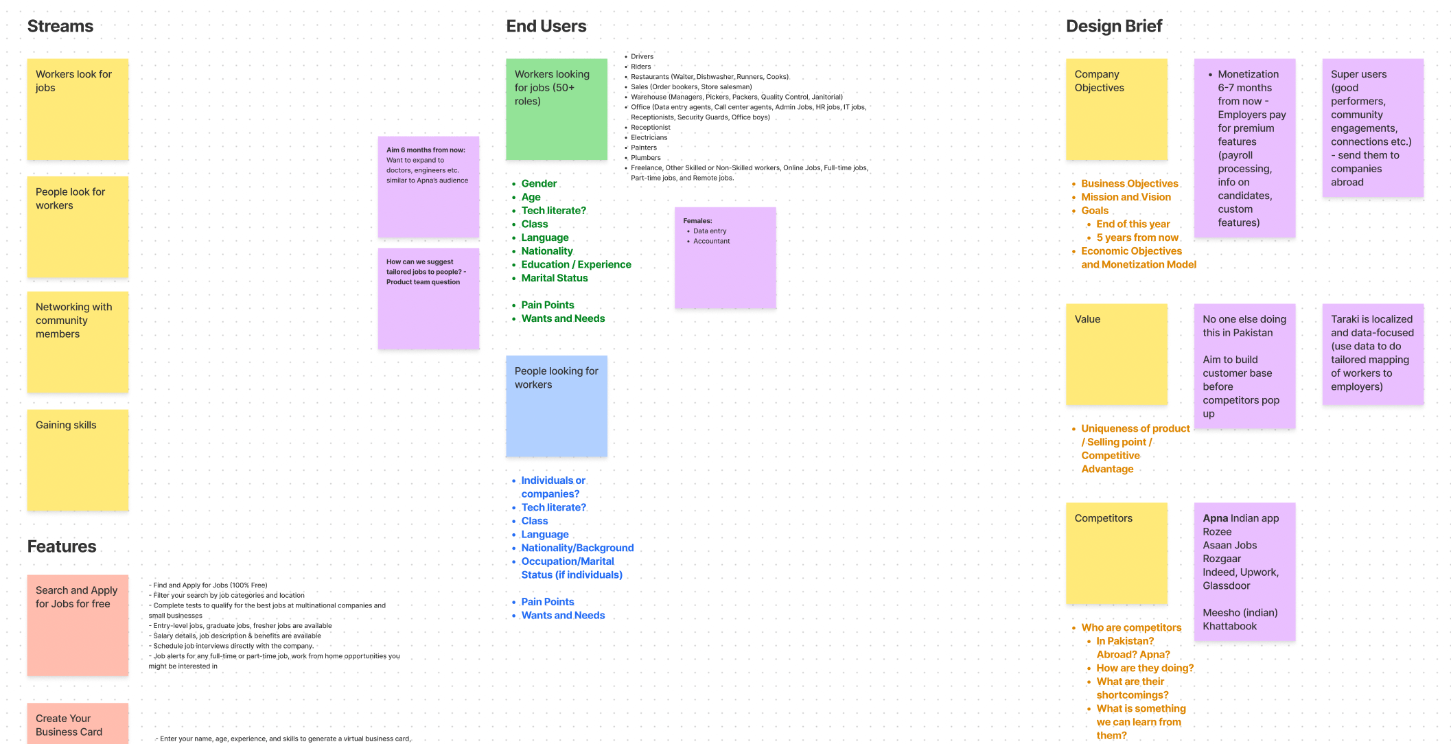
Knowledge Map on Figjam
04. UX Strategy Sessions
In order to understand customer pain points and ideate for solutions, I conducted co-creation UX Strategy sessions over the course of a month with both product teams, i.e. job-seeker product and employer portal.
Prior to these sessions, I prepared a template on Figjam consisting of the following sections:
I conducted desk research and market competitor analysis for the targeted modules before each session. The activities I had planned to do with the team included:
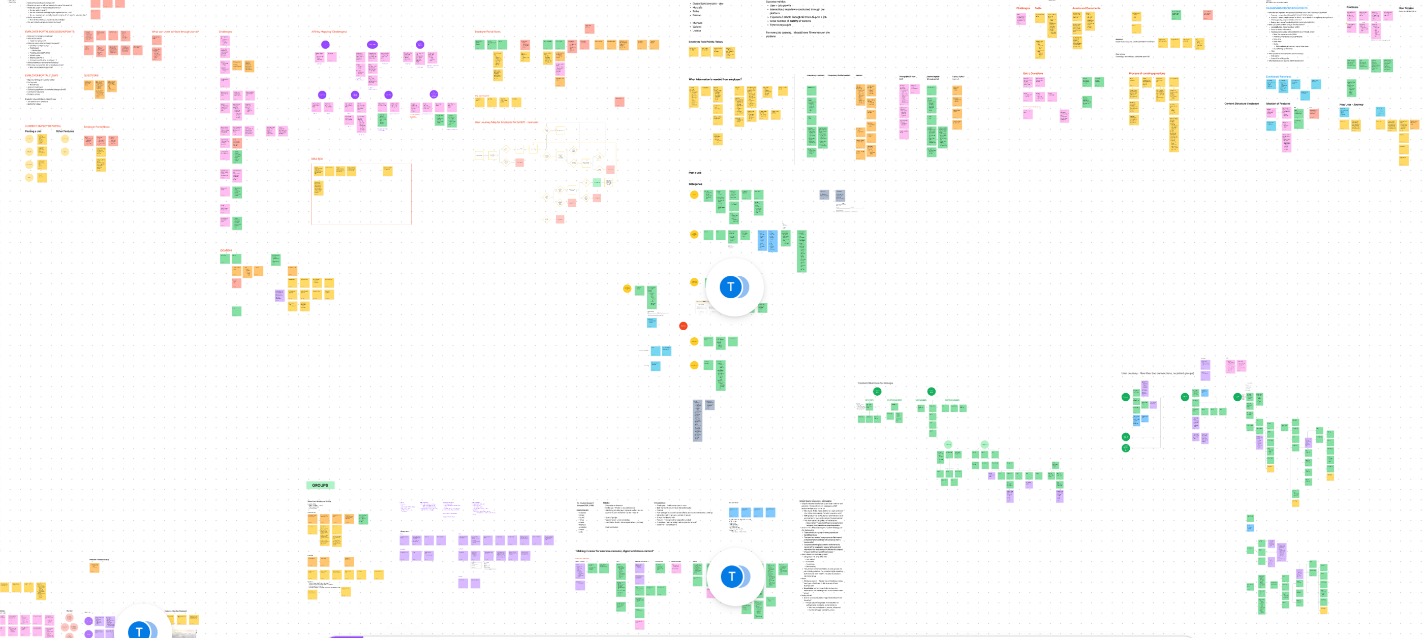
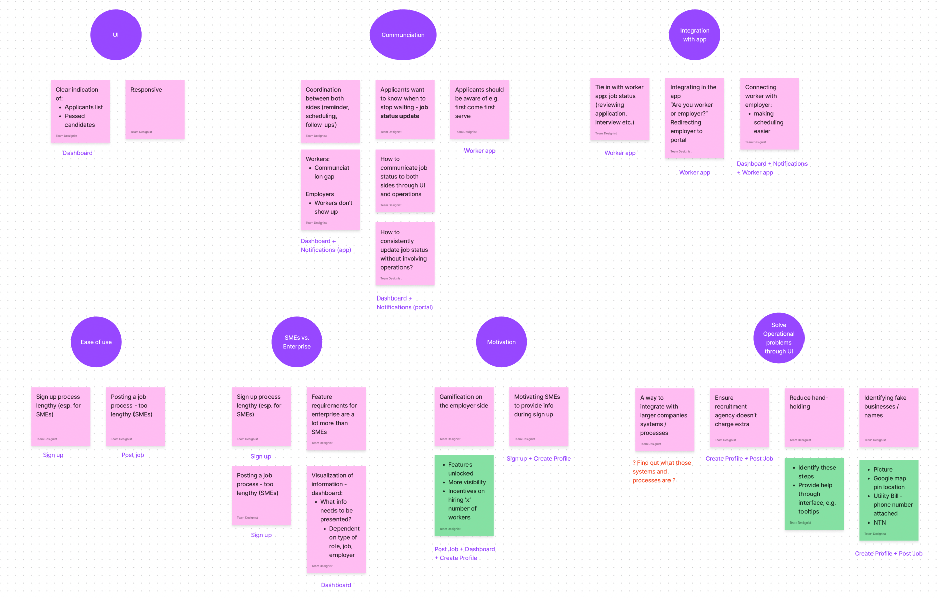
Affinity Mapping of Employer portal pain points / ideas
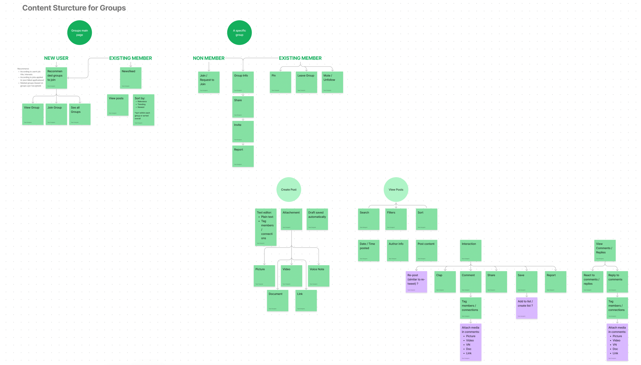
Content Structure for one of the modules
Due to signing an NDA with Taraki, I cannot disclose specific pain points associated with both products and how I helped them mitigate these challenges.
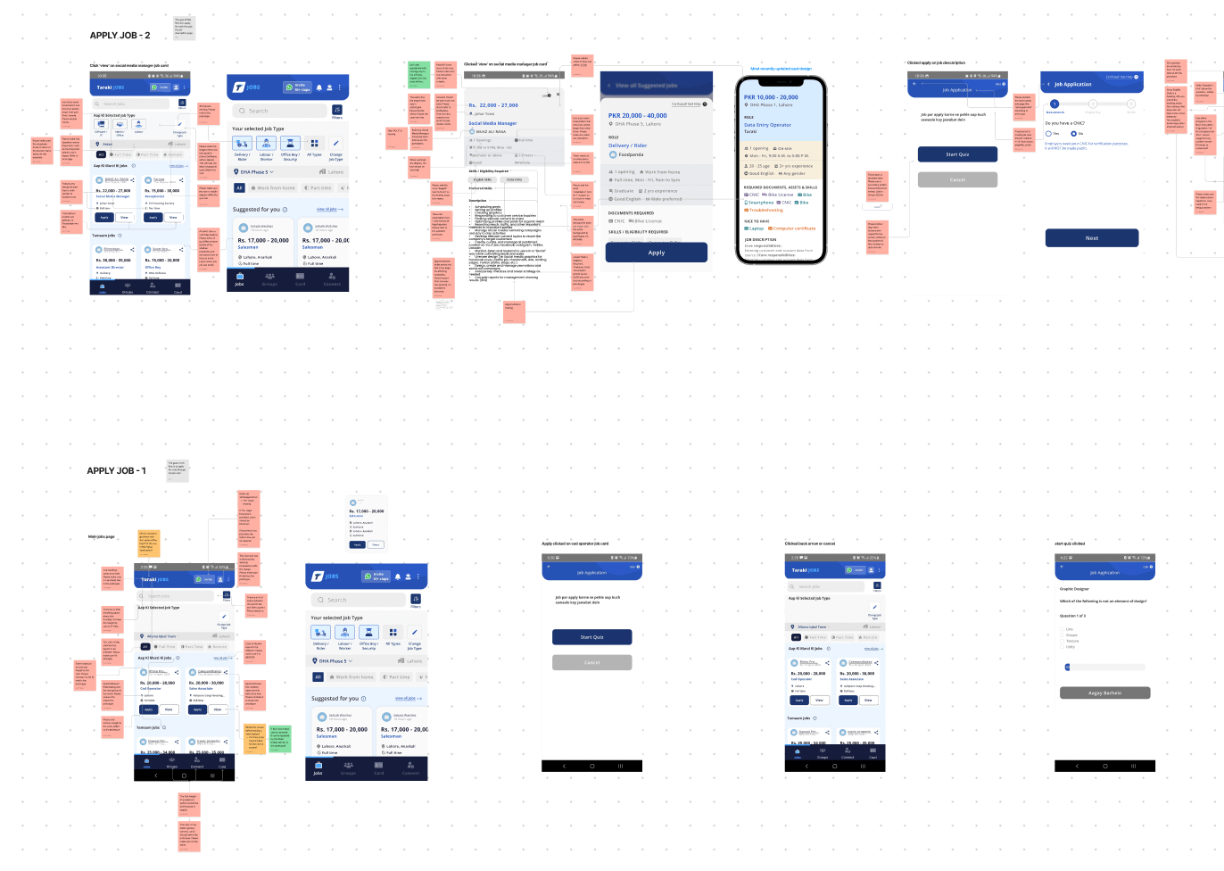
05. Wireframing
In each UX Strategy session, we collaboratively designed low fidelity wireframes for each module’s major flows. This helped us understand the navigation, user flows and interactions.
Following this, I digitized wireframes on Figma and completed the flows.
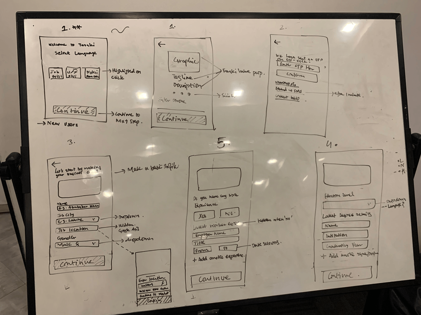
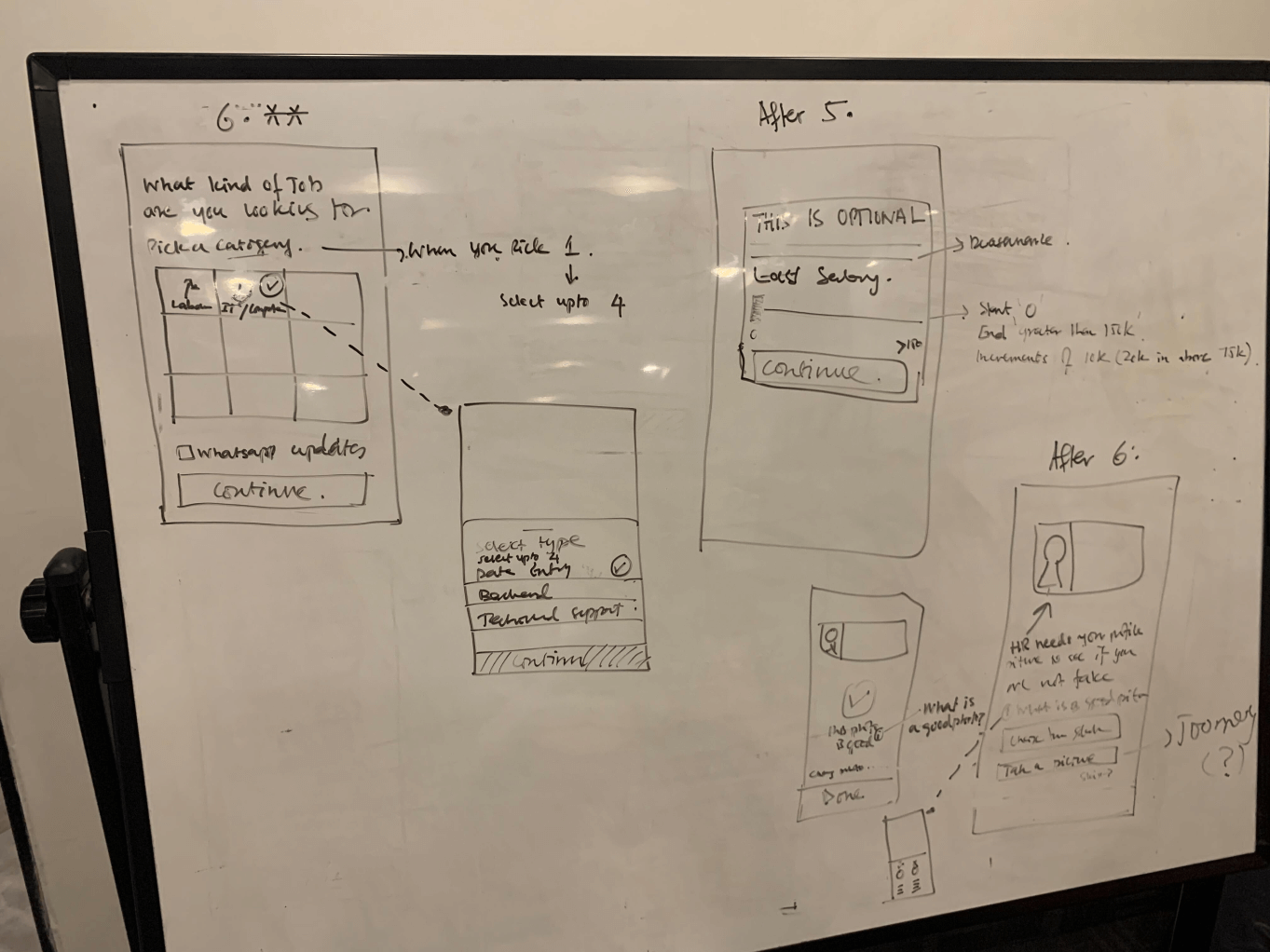
A glimpse of digitized wireframes on Figma
Wireframes helped us focus solely on designing flows that reflect the best user experience. We kept in mind the following heuristics:
Taraki users were low-to-medium literate people who were accustomed to using applications like Whatsapp and YouTube. Hence, I made sure to stick to interactions they are familiar with so there is transfer of knowledge.
This included, for instance, clearly communicating to users where they are in the job application process via a progress bar.
This meant guiding users with clear action items in case they make a mistake so they can recover from errors.
This involved making flows less complicated, only asking users to enter information that is absolutely necessary.
06. Design System
DESIGNING A BRAND GUIDE
I worked with a UI/UX designer to tighten up the Taraki logo, formed their brand guide and included a color palette (primary, secondary, semantic and neutral colors), typographic system, icon library as well as illustrations and their usage.
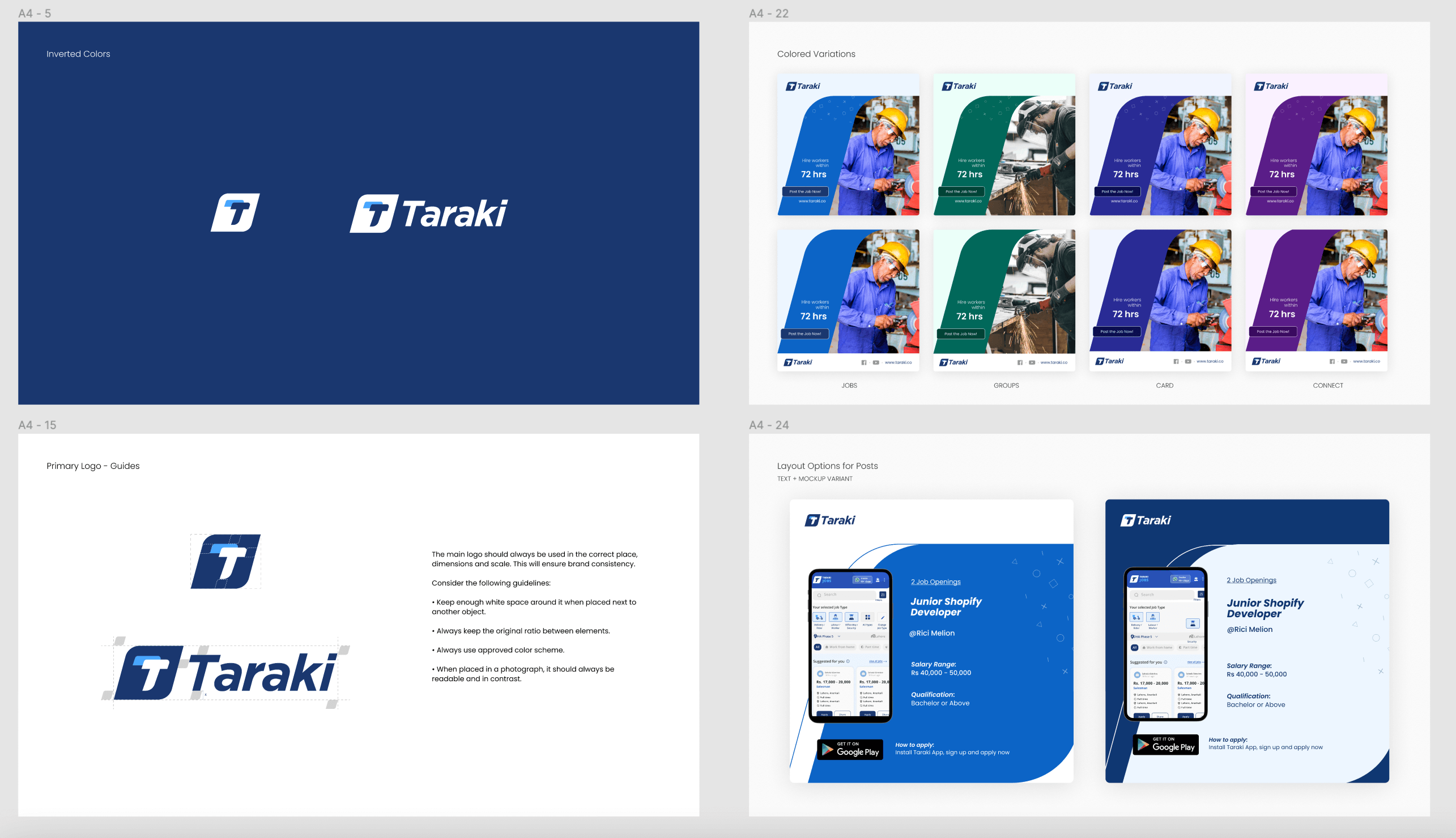
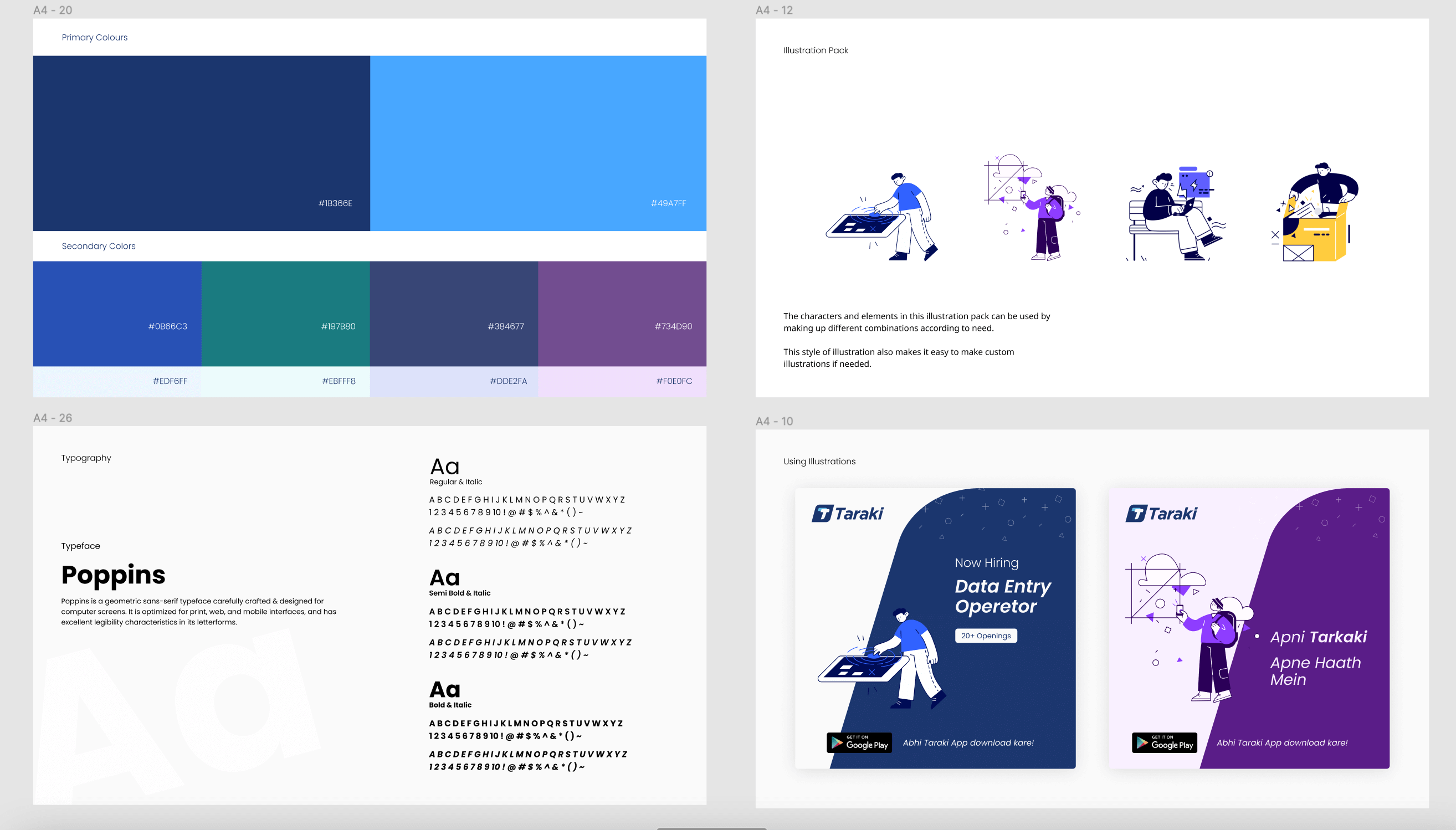
Taraki’s brand guide and visual guide for social media
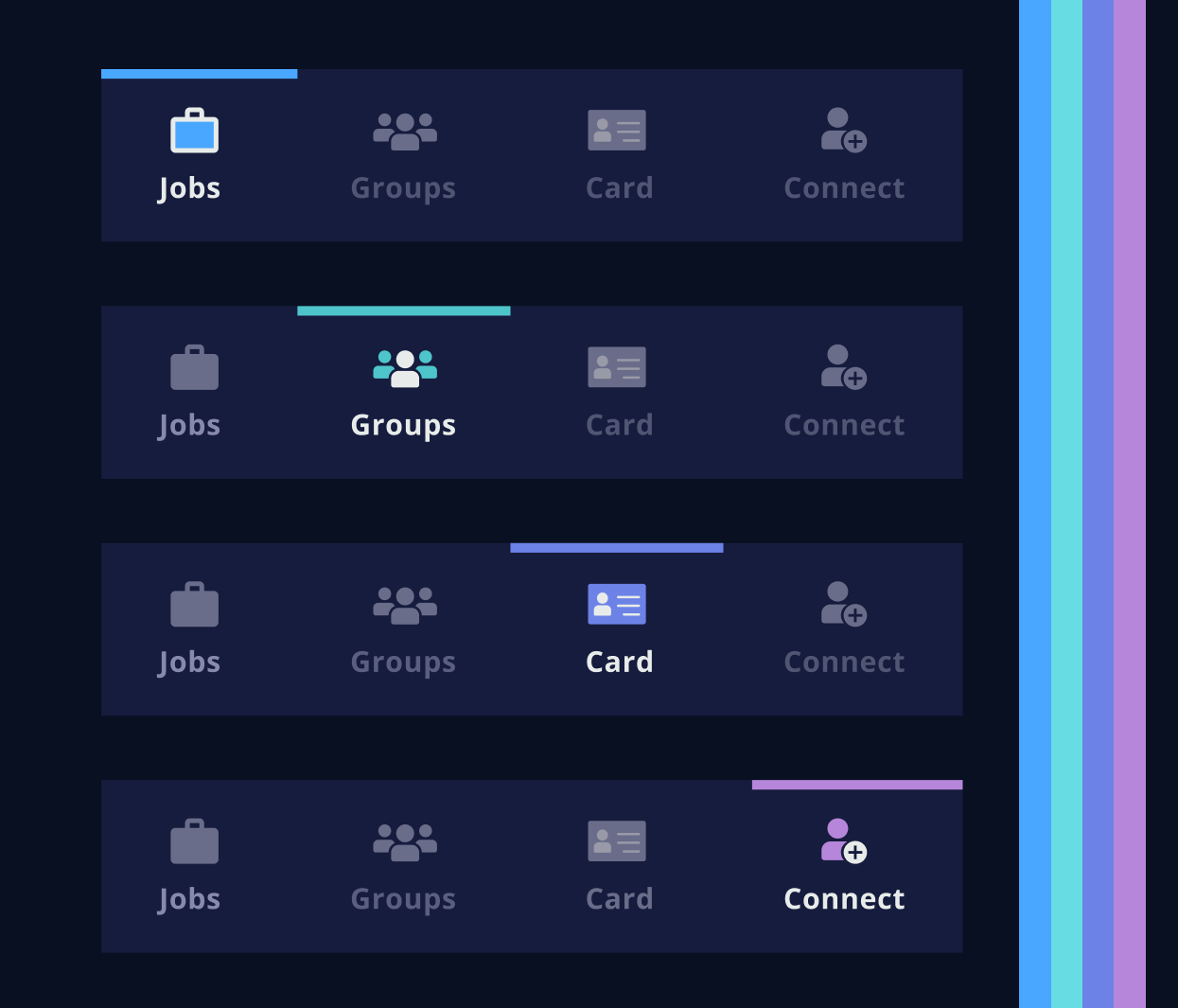
Taraki's bottom navigation illustrating different color hues assigned to different modules
FORMING A DESIGN SYSTEM
Next, I worked on forming a design system. This included button variations, input fields, selectors, cards etc. as master components in Figma.
I informed the team that the design system will evolve once I work on UI design as more complex interfaces are designed which require unique components.
The initial design system encompassed the following
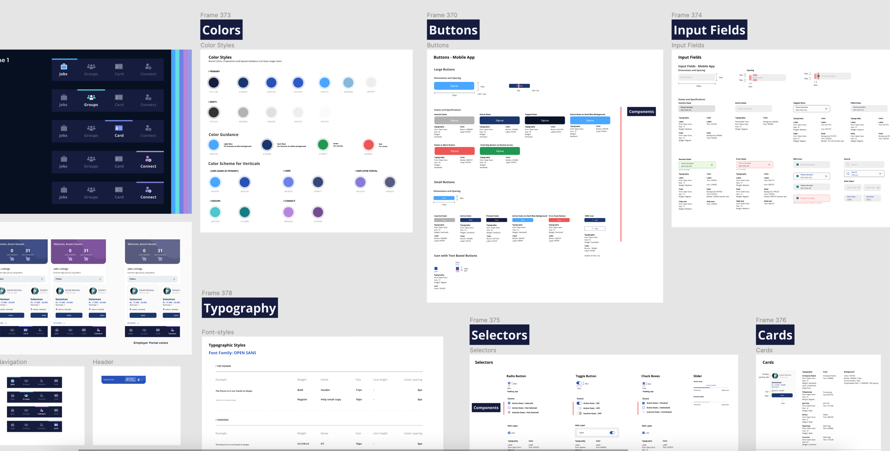
A glimpse of the design system
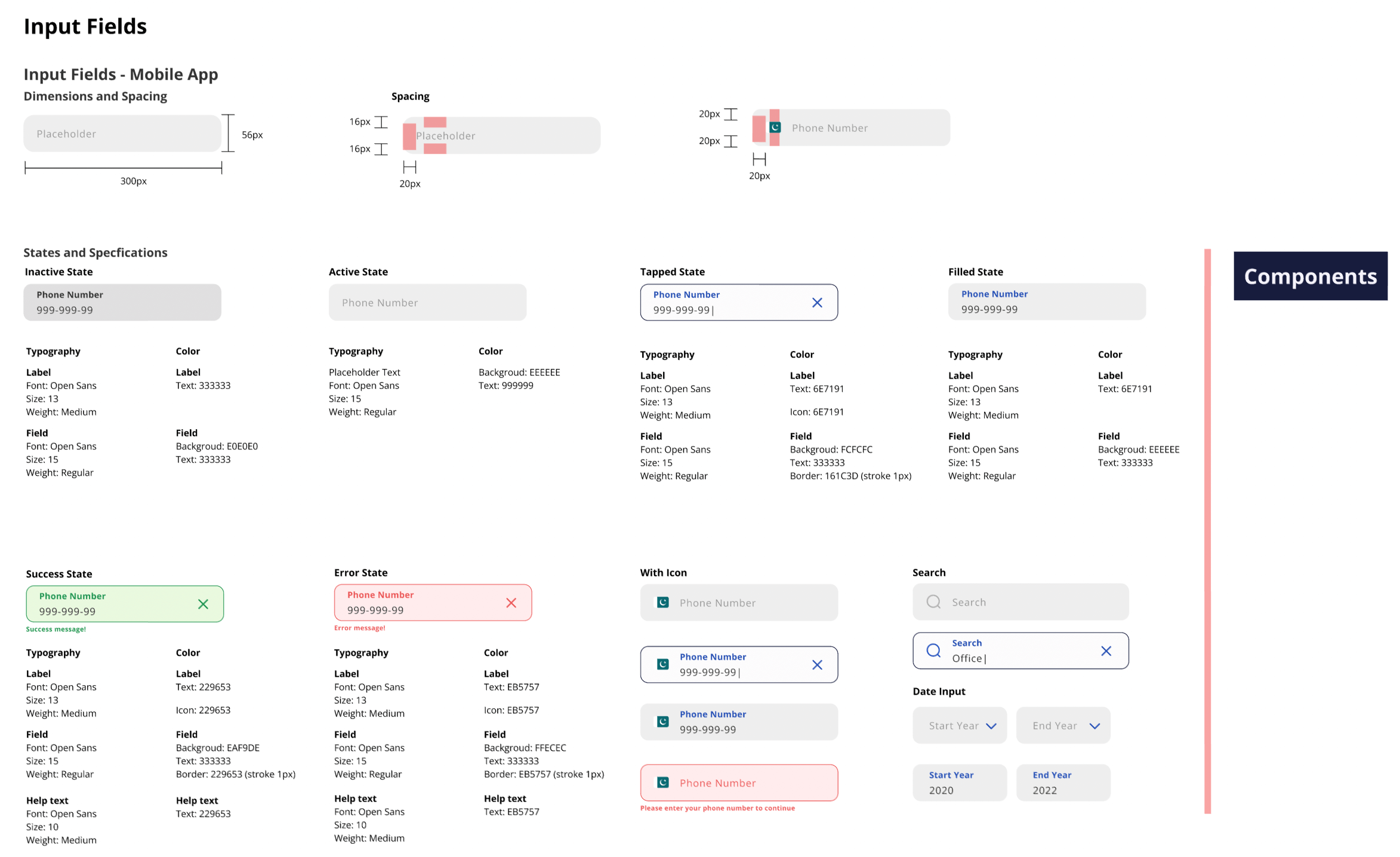
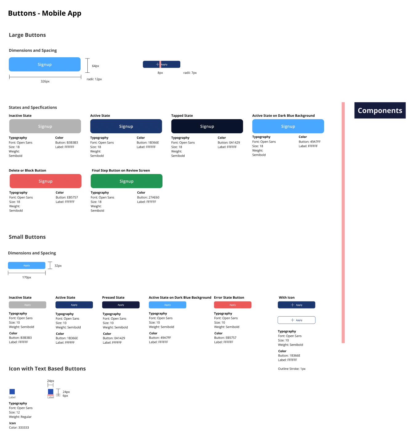
Various components of the design system
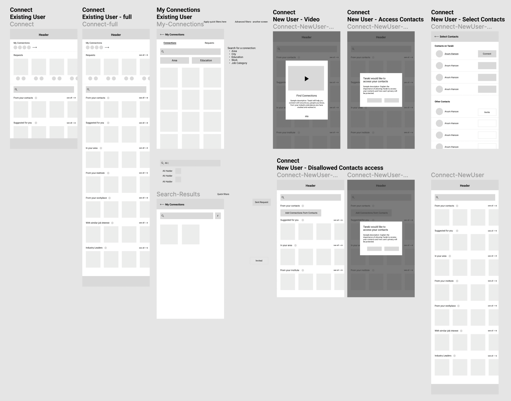
06. Prototyping / UI Design
Once the initial design system was set up,
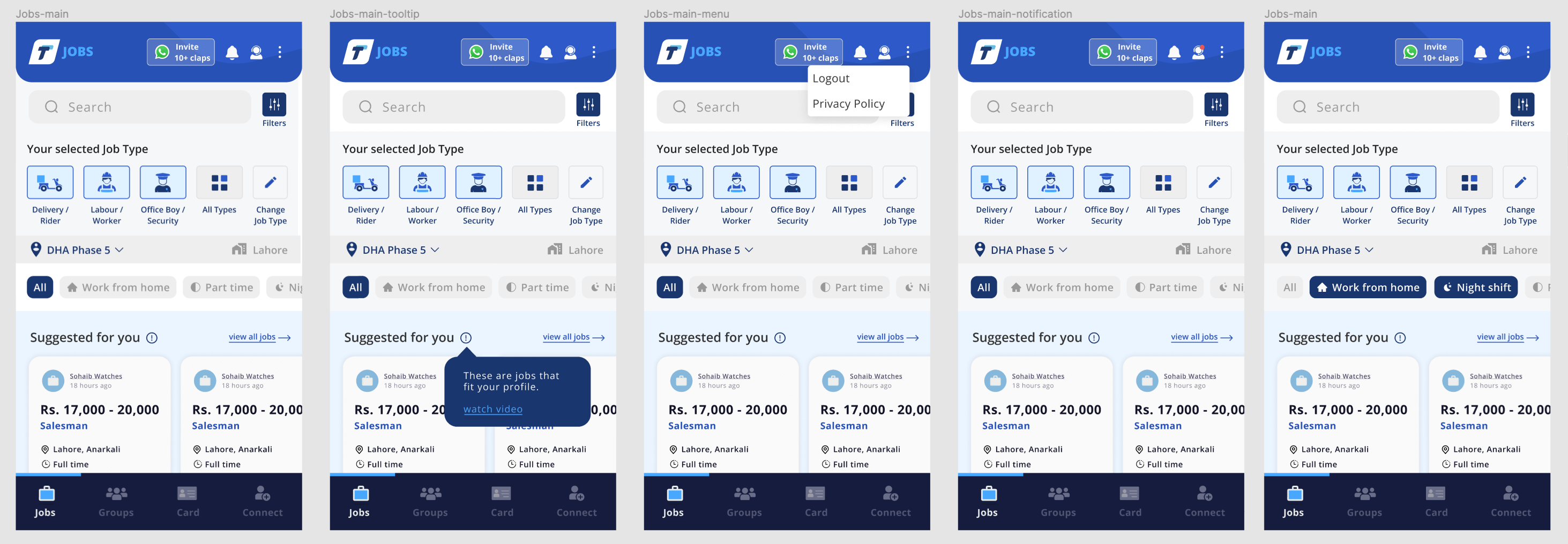
Every interaction designed for the main Jobs screen
Happy paths and error states
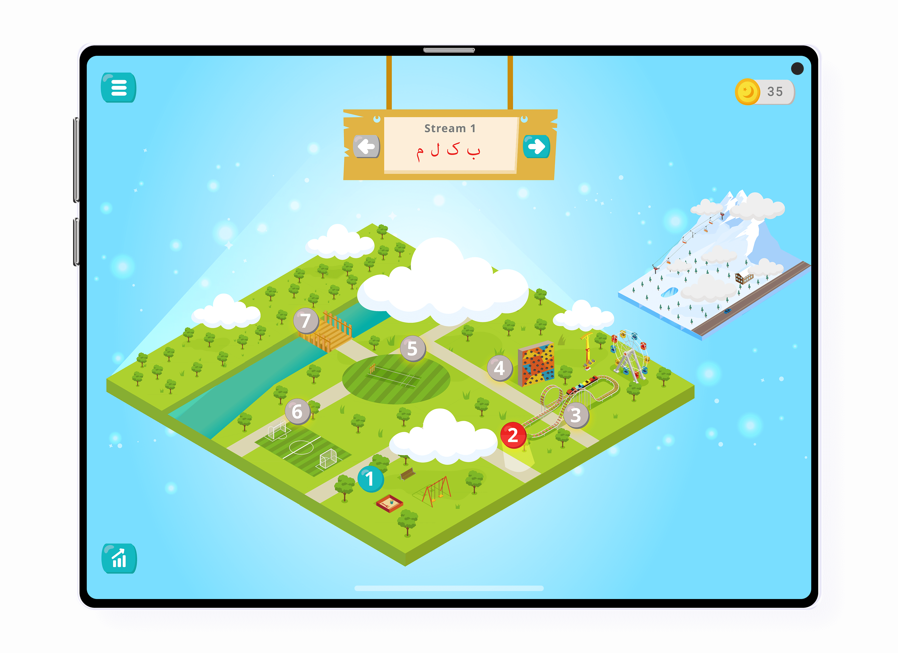
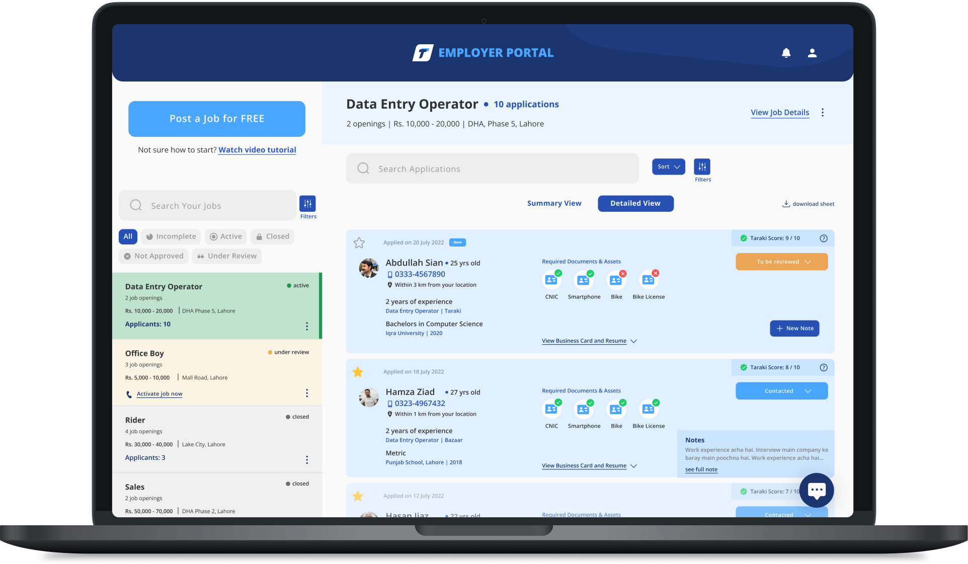
Hi-Fi responsive and interactive prototypes for the job-seeker product and employer portal
Closer Look at Mobile App prototypes
Closer Look at Web Portal prototypes
08. A/B Testing
I planned to work on UI in parallel with A/B Testing.
Taraki was built using Bubble framework and hence, development speed and cost was lower than custom development. Due to this, the team decided to conduct A/B testing of developed versions to validate designs.
The process we followed was:
A/B testing and data analysis on Mixpanel helped us identify which design variant in a flow is preferred by users. Furthermore, the customer service team was in constant touch with users so they received feedback first-hand about changes. The idea was to test with users before finalizing the design.
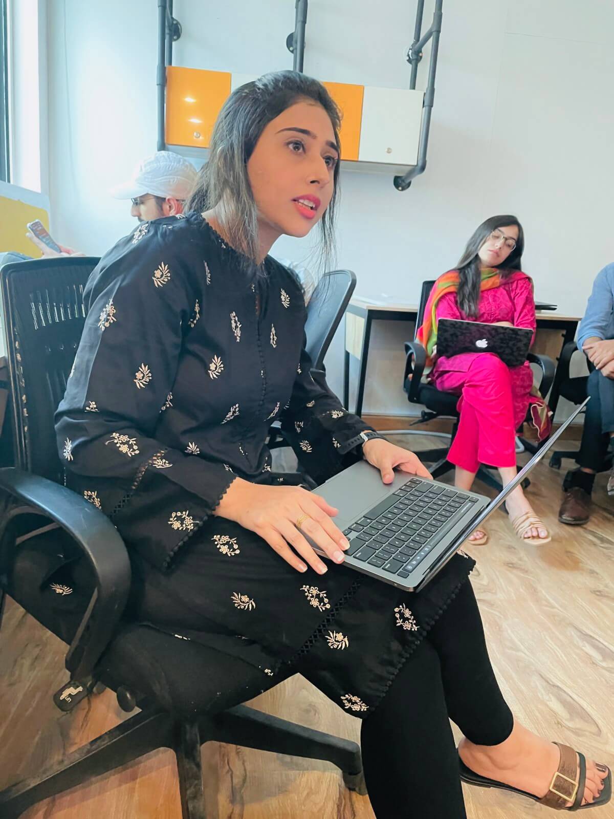
Leading a session with the Taraki team at their head office
09. Usability Testing
We also conducted usability tests. I created a detailed guide for the testing to take place. It majorly consisted of:
This involved:
This involved:
This involved:
A glimpse of the Facilitator's Guide for Usability Testing
We picked a few modules and conducted usability testing of around 15 participants (including users and non-users of Taraki app). The main objective was to test Signing up to Taraki (with new users), and test other modules that follow.
Conducting these tests helped us identify:
- User biases that exist when it comes to information flow. For instance, upon selecting the location while signing up, users perceived the location to be the ideal job location (rather than their own location)
- Transfer of knowledge from using other apps. For example, users were aware of how to upload an introductory audio in the job application as the interface look similar to Whatsapp’s voice-note
- Additional features and suggestions, including the ability to receive updates about their job application from the employer
- How users with different educational background use the app differently
Usability testing not only helped us test the application’s flow and interface and receive suggestions, but also made us realize that we should revisit our Personas and categorize people based on their tech literacy level. It also meant people with very low tech literacy don’t necessarily fall within our target personas.
Figjam dedicated to noting down feedback, observations and comments screen-by-screen for each module.
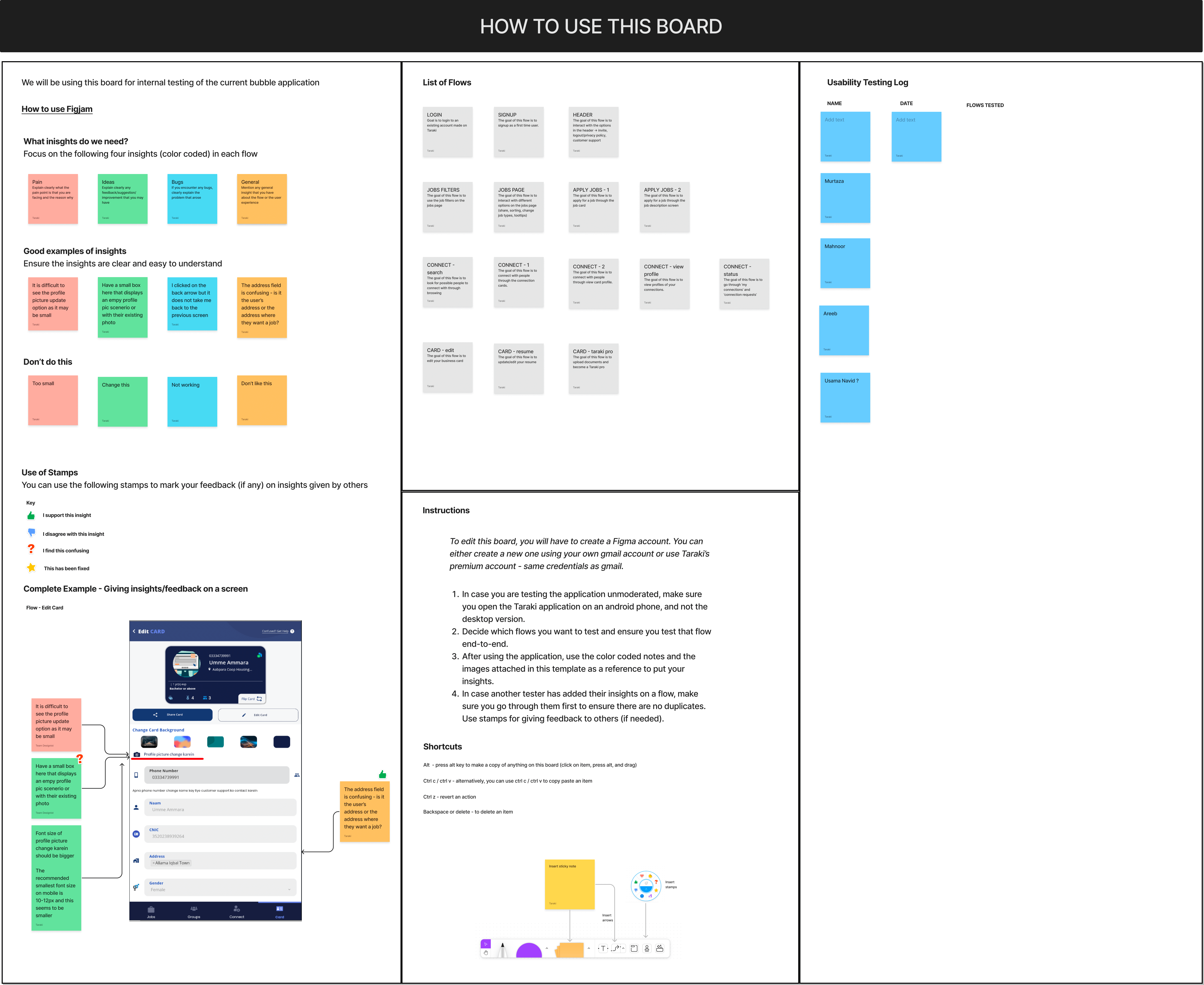
We also defined rules for noting down insights and made the activity efficient with the use of stamps and color coded sticky notes on Figjam
10. Impact ✨
The complete revamp of the Taraki app resulted in a major improvement in metrics, including a large number of new users, their consistent engagement and retention over time. Following the revamp:
JOB-SEEKER APP
EMPLOYER PORTAL
Till May 2023 Taraki had 42 employers who had successfully
hired 277 candidates.

SETTING UP AN IN-HOUSE DESIGN TEAM
The definition of processes, extensive documentation on Notion and keeping all departments involved in co-creative sessions had a great role in hiring and setting up the project design team. I ensured that all project design files are categorized, organized and well structured to be able to hand it off to the new hires. I was available for walkthroughs and any kind of guidance for a couple of months before wrapping up.
Retrospective
Taraki is a project I’ve seen grow tremendously before my eyes. I thoroughly enjoyed working with the team which consisted of graduates from the top university in the region and needless to say, they were brilliant and I learnt a lot from them.
Leading UX Strategy Sessions with a team of 15+ representatives of each department including top-management allowed me to explore the leadership side of me. In several instances, I would find myself advocating for design that suits Taraki’s users best and is feasible to implement. At the end of each session, the team would feel drained but very accomplished to have collaboratively made a difference.
The products I set the foundations of, helped jobless people in Pakistan get jobs, it helped them bring food to the table for their families and for me, there is nothing more beautiful and meaningful than that.