Project Foundry - Building a design & data ecosystem for creatives
Project Foundry - Building a design & data ecosystem for creatives

About the initiative
Foundry is a nationwide transdisciplinary community of faculty, practitioners and students in Pakistan that helps people develop their creative abilities in the field of design and data.
LAUNCH PROJECTMY PROCESS
01. Problem Identification
With a recent wave of design and data enthusiasts in the region, Pakistan lacked a unifying platform that helps creatives to collaborate, learn and grow.
How might we..
design Pakistan’s first design and data center for interdisciplinary creatives?
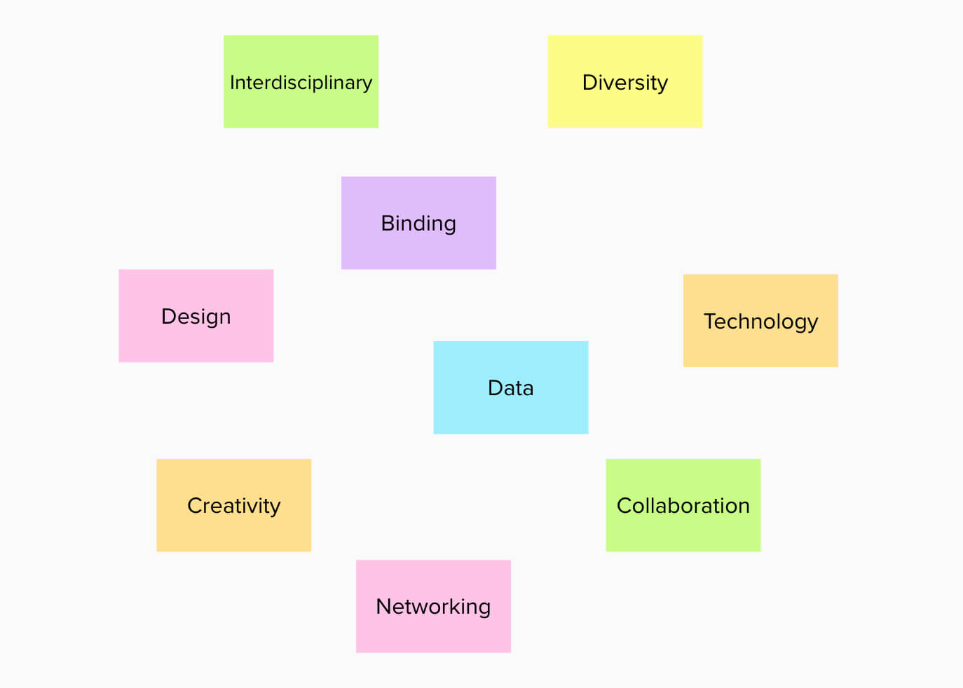
Initial knowledge map
02. Online Presence & Branding
We realized an online presence is crucial for such an initiative, and in the beginning it may only be feasible to run the inititative virtually due to the global pandemic (COVID-19).
Hence, my team and I decided to focus our energies on creating a website and working on the branding to begin with.
02a. Competitor Analysis
To gain inspiration and identify possible gaps, we studied 6 well-known design labs/centers. We decided to list areas of focus which would streamline our competitor analysis phase. We wanted to know about:
We then created a competitor matrix.
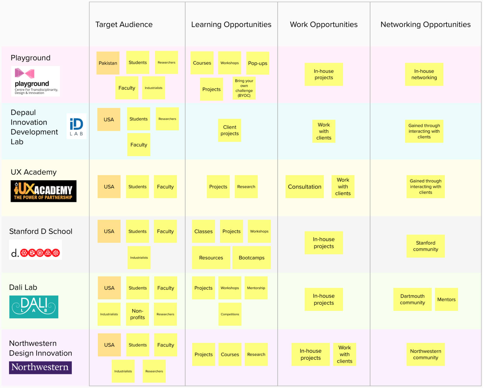
Competitor Matrix
02b. User Research
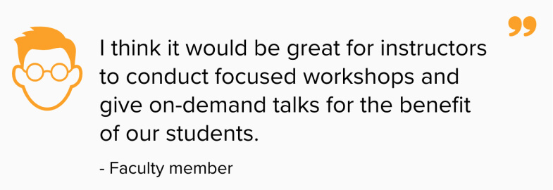
In order to design contextually, we conducted semi-structured interviews with 7 students and faculty members at LUMS to understand their current needs and desires.
We asked them open-ended questions like what their ambitions are and what they think is missing from their student life that would help them grow professionally.


02c. Ideation
We began an ideation session focused on the “How Might We” statement: How might we design Pakistan’s first design and data center for interdisciplinary creatives?
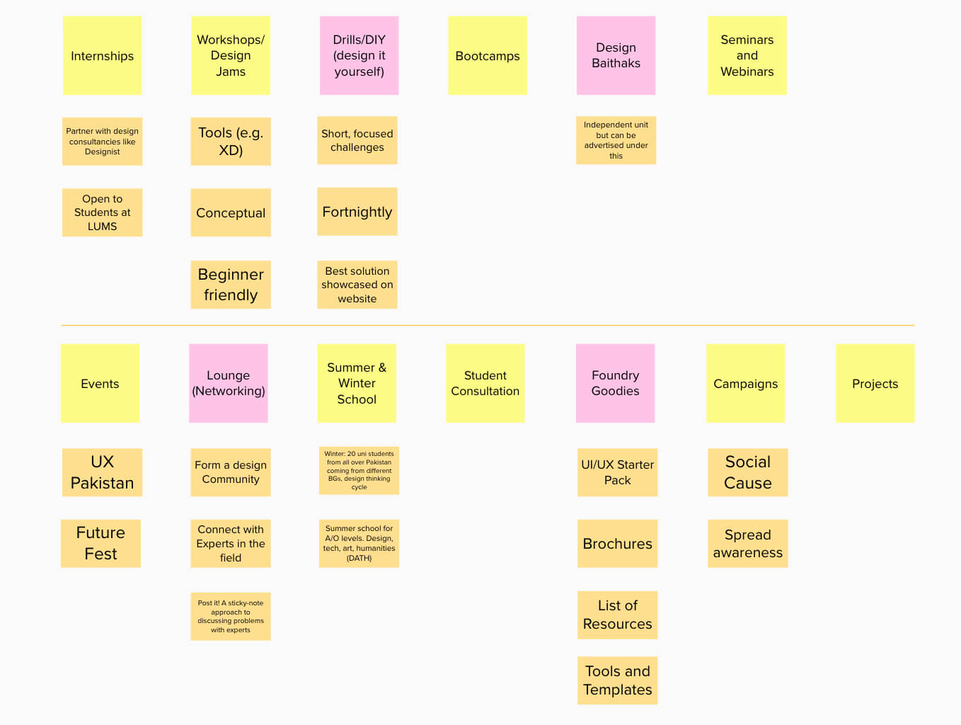
Ideation session
We came up with some innovative ideas (pink notes in the image above) including Do It Yourself (DIY) - a short focused design challenge; Networking Lounge - a virtual lounge for students to connect with industry professionals etc.
Creating an optimal Site Map
This was perhaps the most challenging part of the project. We had set off to design a huge platform, yet we strived to create an intuitive skeleton for easy navigation. After several iterations, we proposed the following:
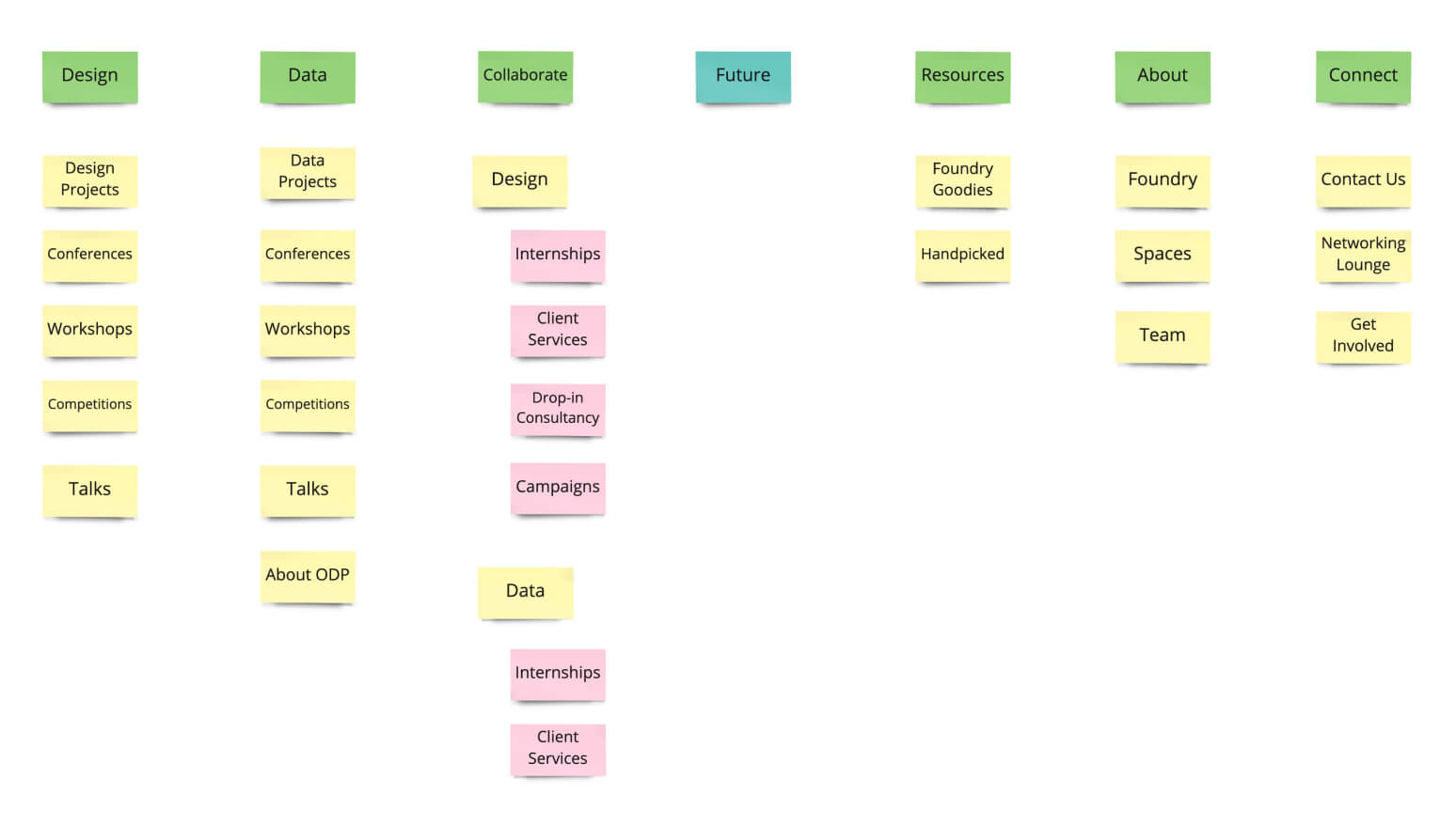
Proposed Site Map
Creating an Information Architecture
Next, designing an Information Architecture (IA) allowed us to explore different sections within all pages and iterate with different layout combinations till we reached an ideal easy-to-navigate structure. To check out the IA, visit my Miro board.
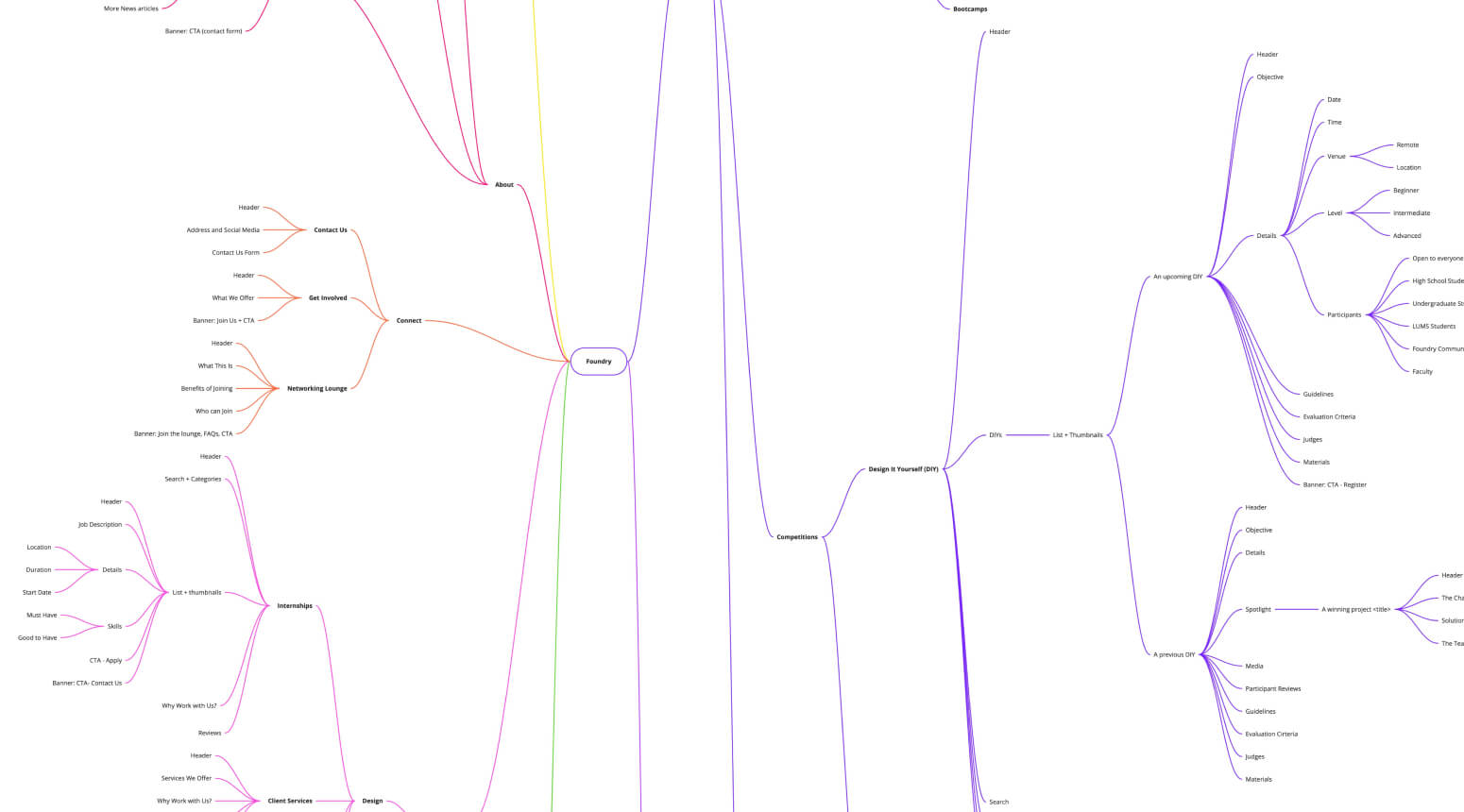
Information Architecture
Creating a Content Structure
Before jumping into prototyping, we decided to lay out our information architecture and form a content structure which would aid us in designing wireframes.
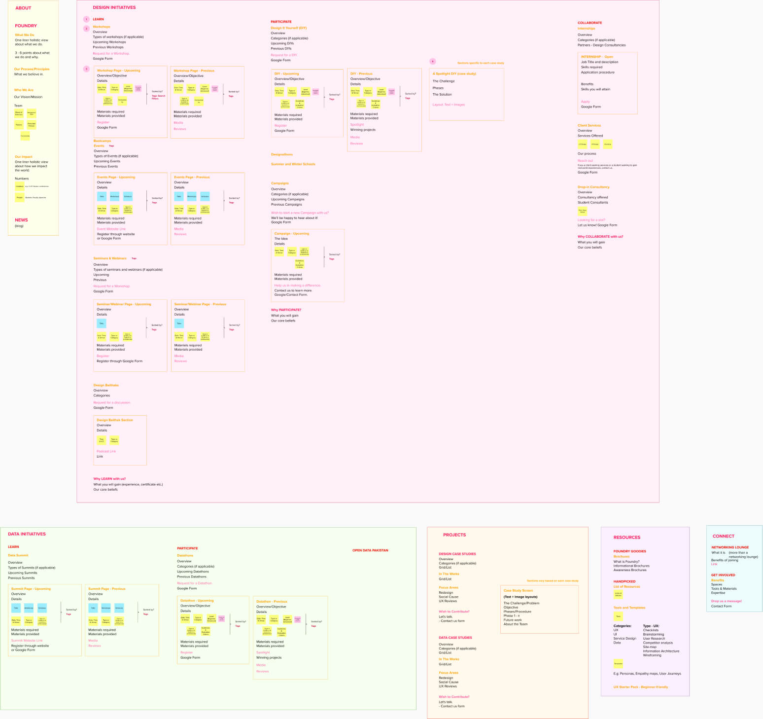
Content Structure
At this point, we were able to join the dots of how the site would be laid out structure and content-wise, and which sections would require what kind of component (paragraph, testimonials, accordion, image, embedded video to name a few). Hence, we were ready to jump into prototyping phase.
02d. Wireframing
When designing wireframes on Figma, we made sure to keep a copy of our information architecture and content structure open for reference. Throughout the process, we were mindful of keeping sections as intuitive as possible.
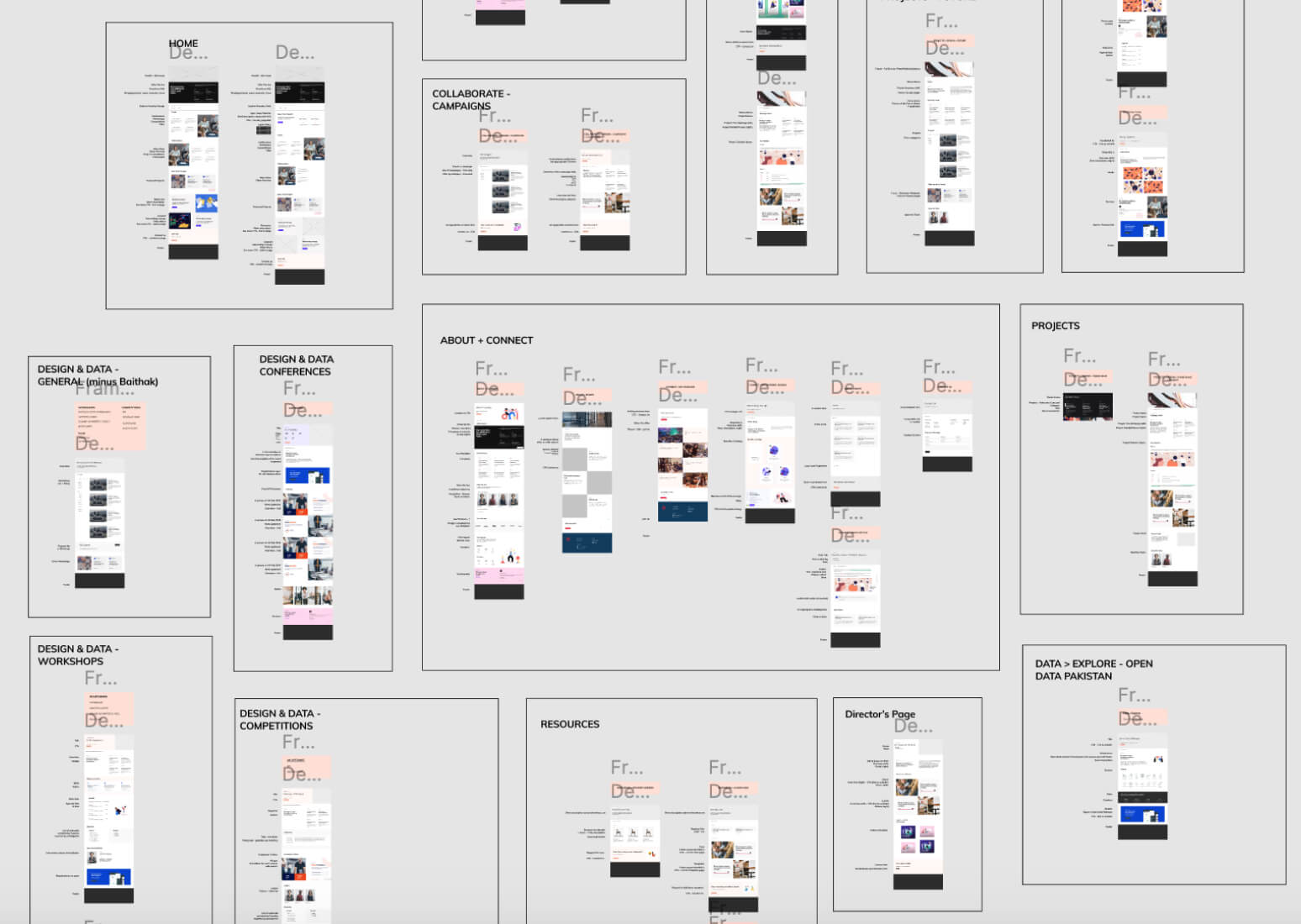
Wireframes
We designed 30+ unique interactive wireframes and were ready to test them with users.
02e. User Testing
We conducted wireframe testing with 4 users (3 students and 1 faculty member). Feedback we received included:
Incorporating User Feedback
We went back to our wireframes and decided to split projects between (1) Student Projects and (2) Foundry Projects - which would include client work.
We realized the importance of keeping cognitive load of users to a minimum - hence we used a number of layouts involving split screens (text + visual aids), catering to Pakistani community which is typically not fond of reading.
02f. Branding
We began the branding process by delineating the core values at the heart of Foundry. While doing so, we extended our initial knowledge map.
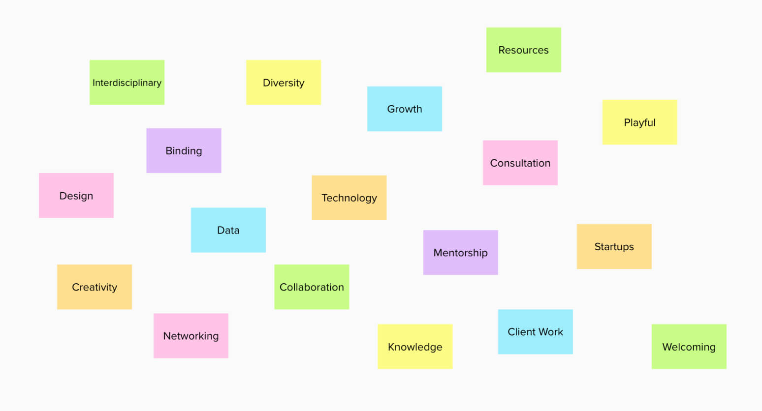
Extension of Knowledge Map
Next, we created multiple moodboards to explore the general direction and look and feel of the brand.
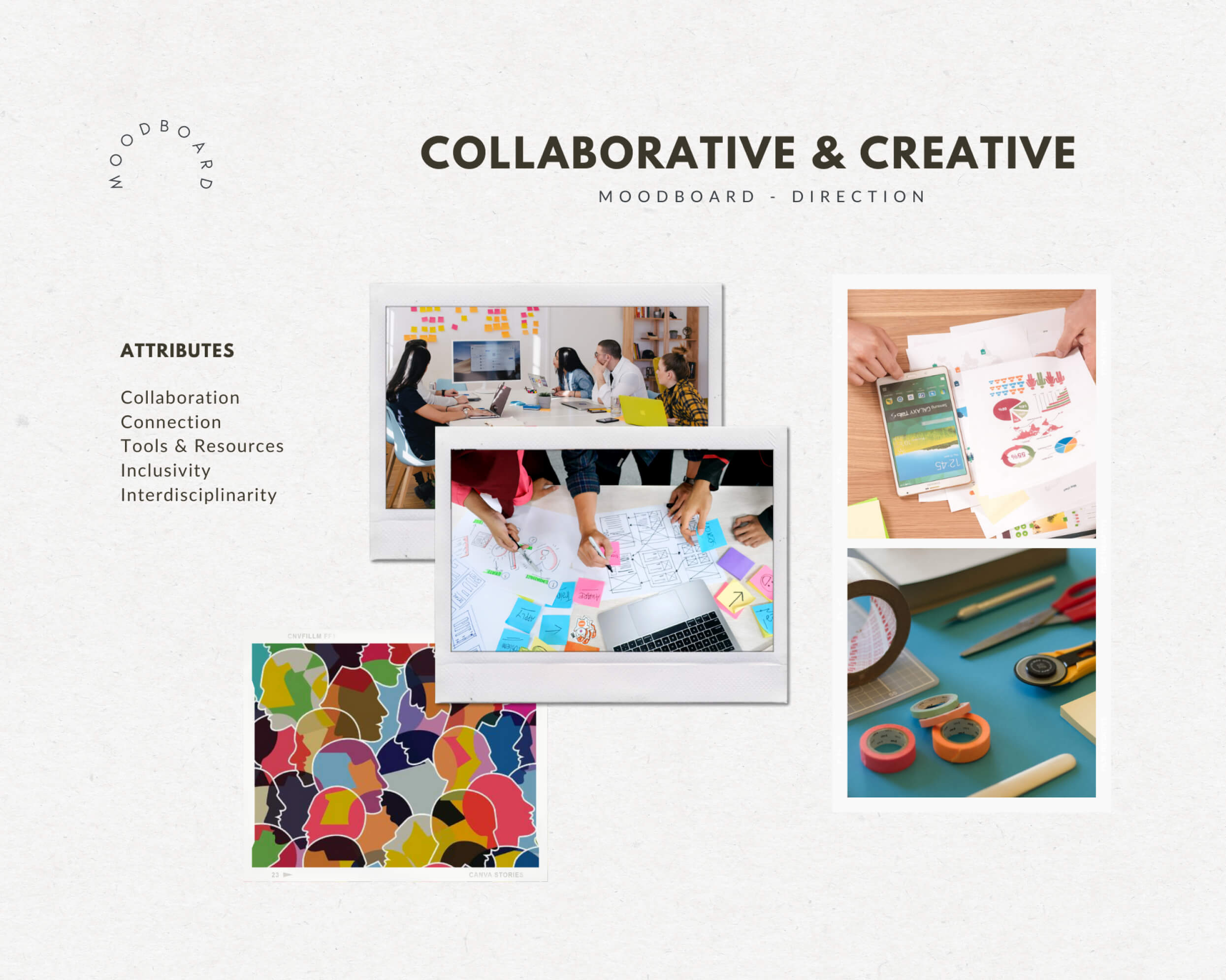
General direction of the initiative
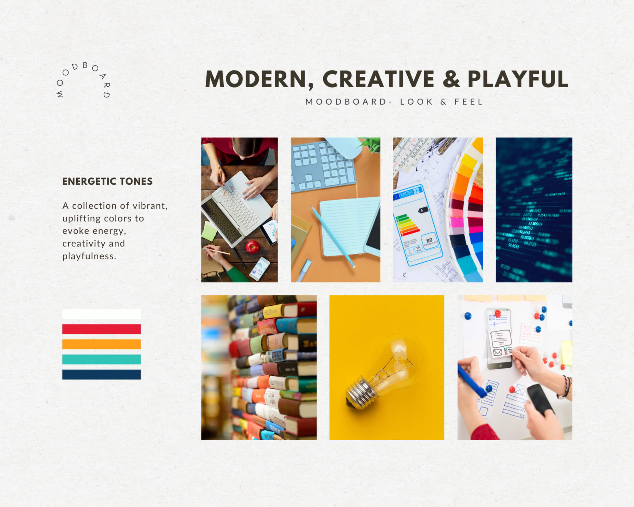
Brand’s look and feel
Moodboards helped us finalize a color scheme and understand the direction our brand can possibly take.
Our color scheme consisted of a range of vibrant colors:

We decided on the name FOUNDRY for the initiative.
Foundry (noun): a factory where metal is melted and cast into different shapes.
-Oxford Dictionary
Metaphorically, Foundry is a shelter which aims to mould students by helping them unlock their creative abilities and preparing them to take on real-world challenges.
Next, we brainstormed for logomark ideas. We explored modern, minimalistic styles which deemed appropriate for our target audience: students and professionals in a collaborative environment.
I started off by experimenting with basic shapes which form the letter ‘F’. I explored ways in which these shapes can be overlapped, subtracted and rearranged.
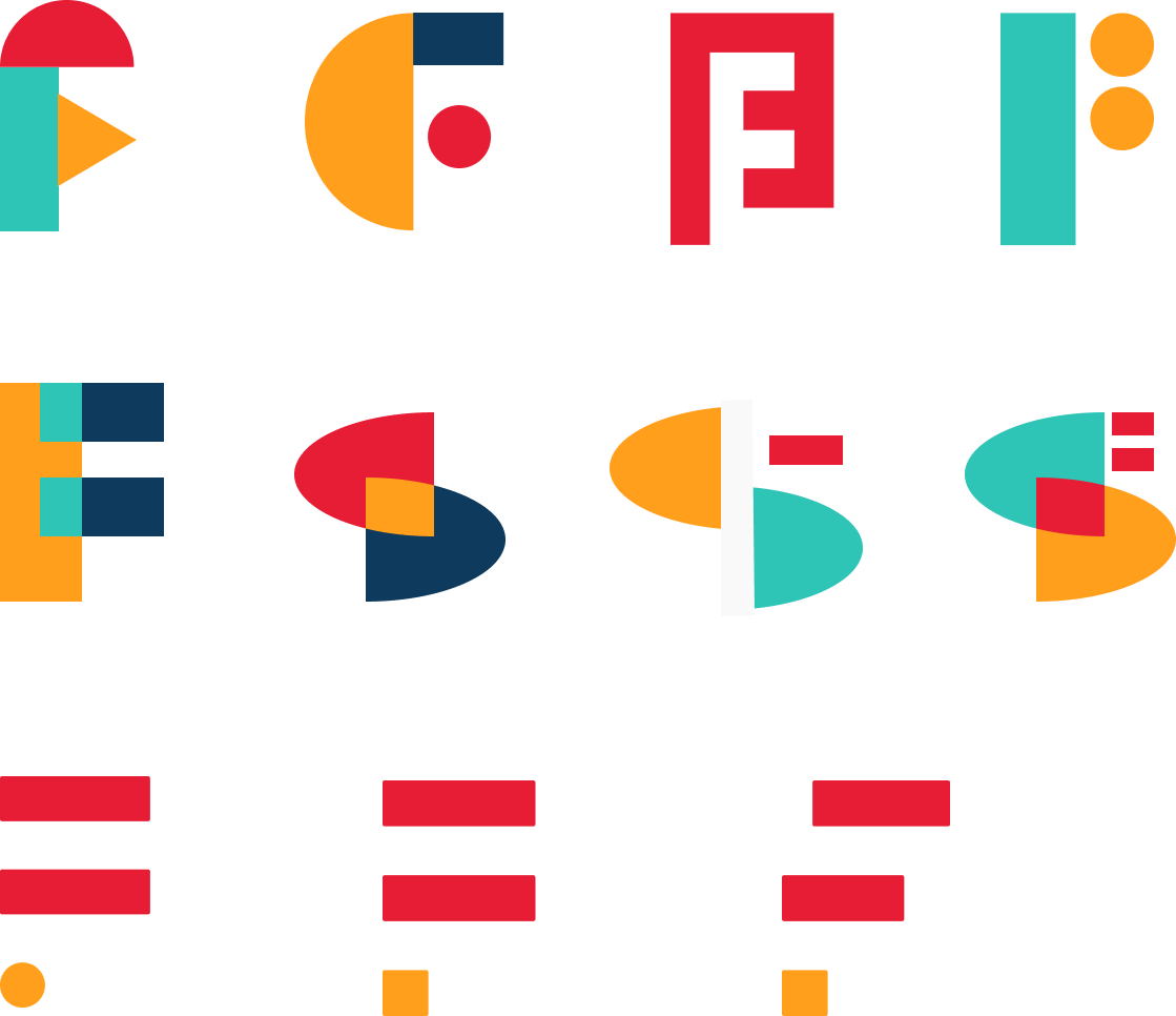
The team loved the idea of playing around with the letter ‘F’, however, none of the logomarks felt natural and suited the idea behind Foundry.
I kept referring back to Foundry’s values and sole purpose: a shelter open to different disciplines aimed towards helping students grow creatively.
It is then that the idea of exploring negative space struck me.

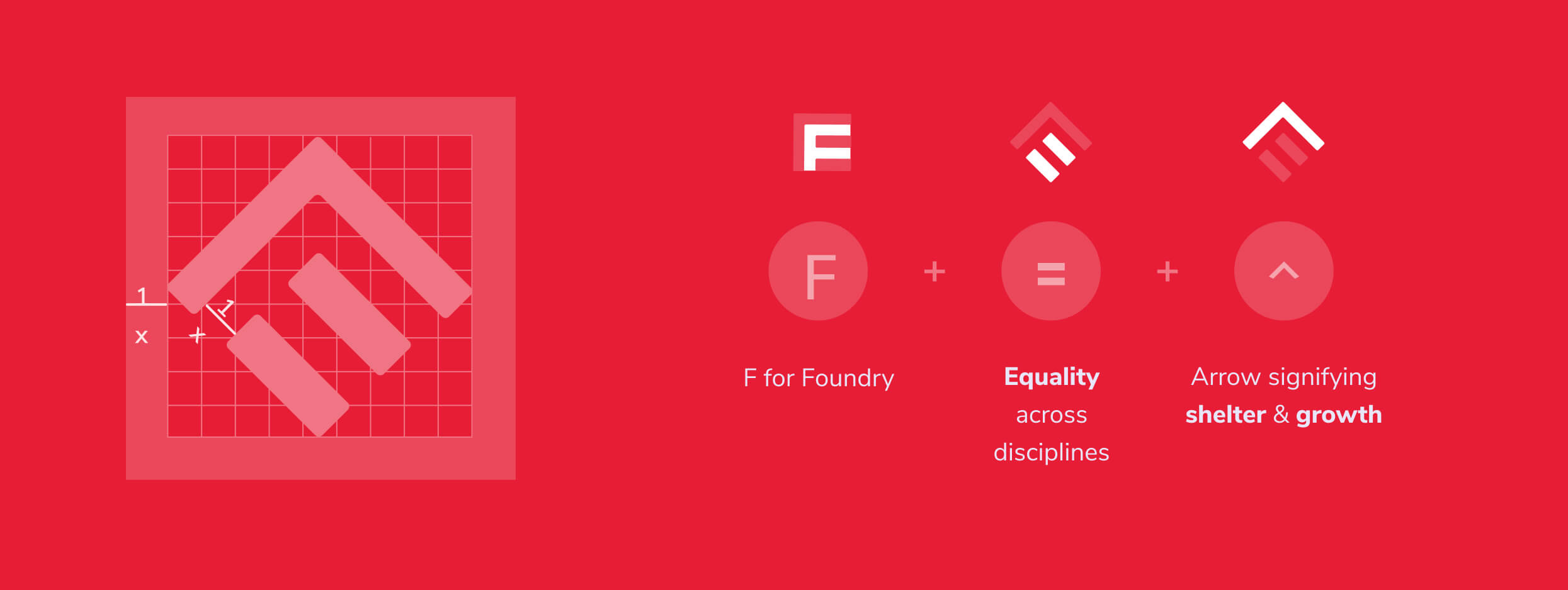
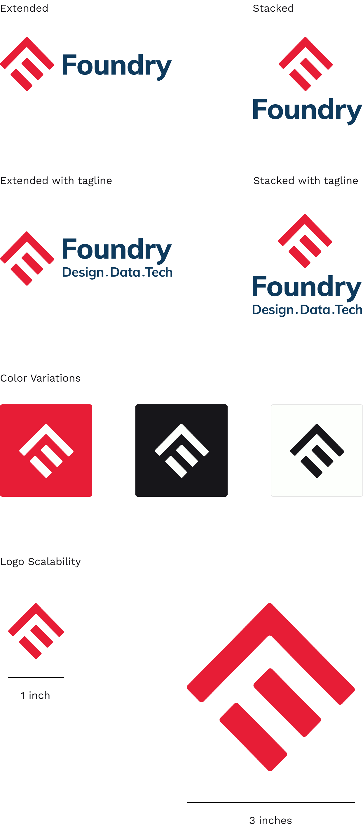
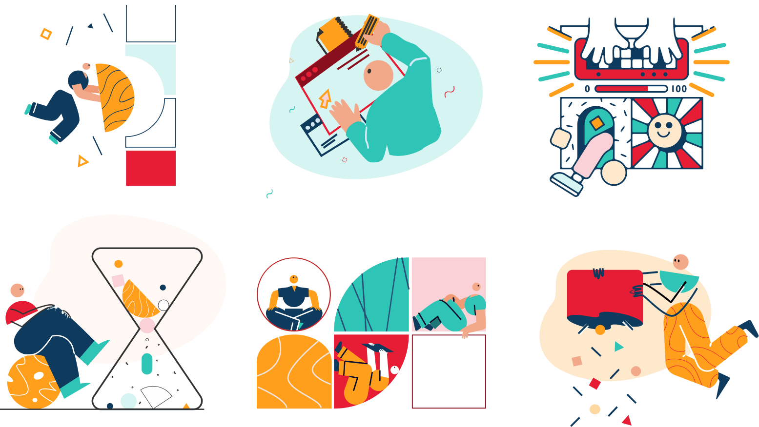
Our art-style consisted of the following attributes:
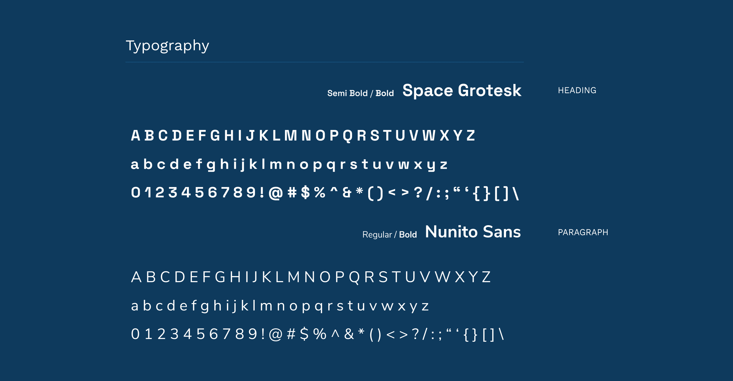
Our typographic choices consisted of the following attributes:
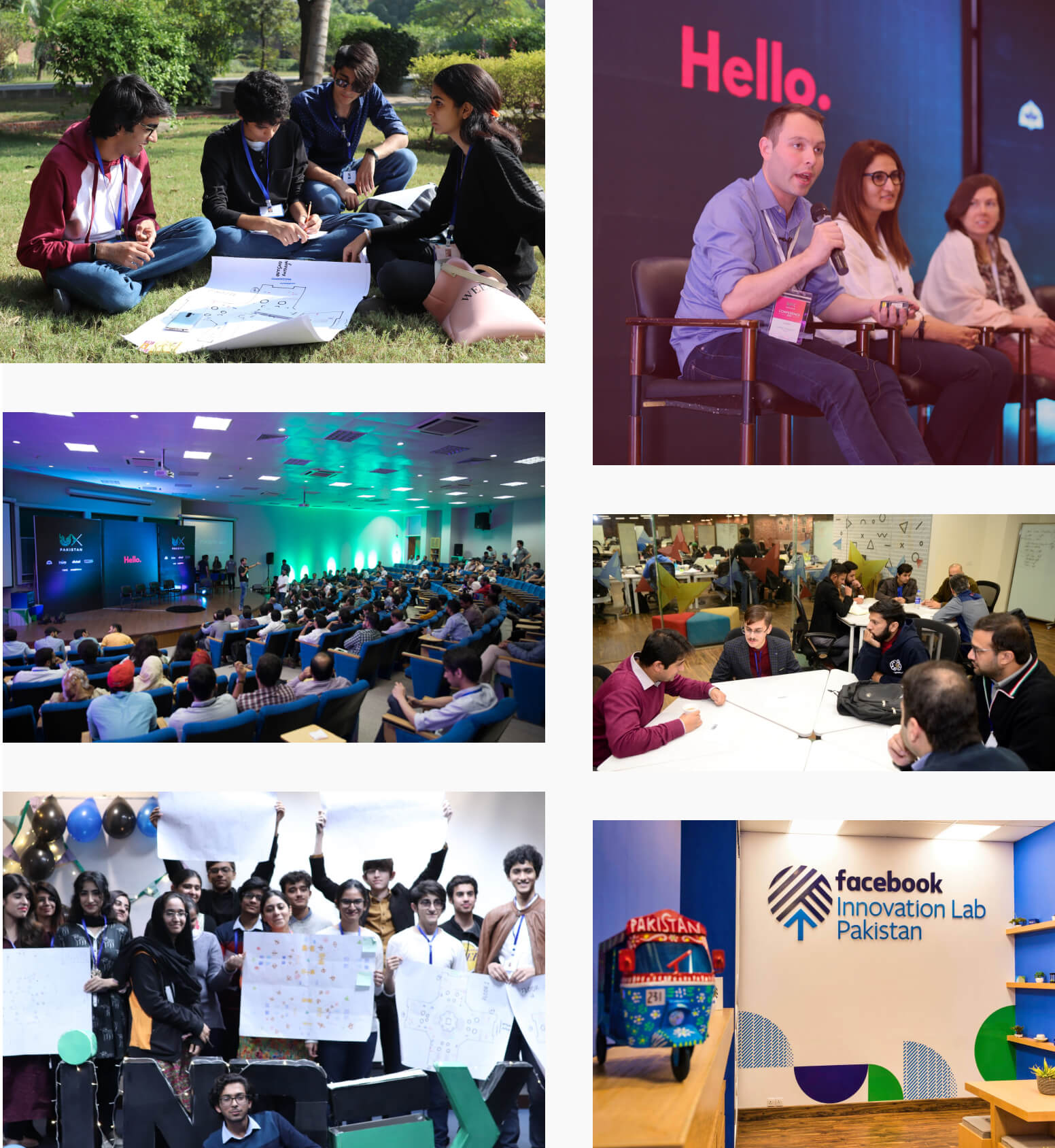
We decided to use real images that our photography team at LUMS had taken during past events, instead of relying on stock images for most sections in order to paint an accurate picture for our visitors.
The way we wanted to communicate to our users through voice, tone and purpose was:
Enthusiasm
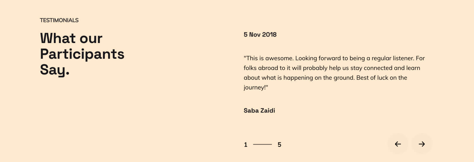
“DIYs are short, focused design challenges for individuals to practice their design skills in order to solve real-world problems. So, grab a pen and paper and get your creative juices running!”
Action-oriented
Authentic
02g. UI Design
Once the branding process was complete, we moved onto converting our wireframes into High Fidelity Prototypes on Figma, closely following our brand guidelines.
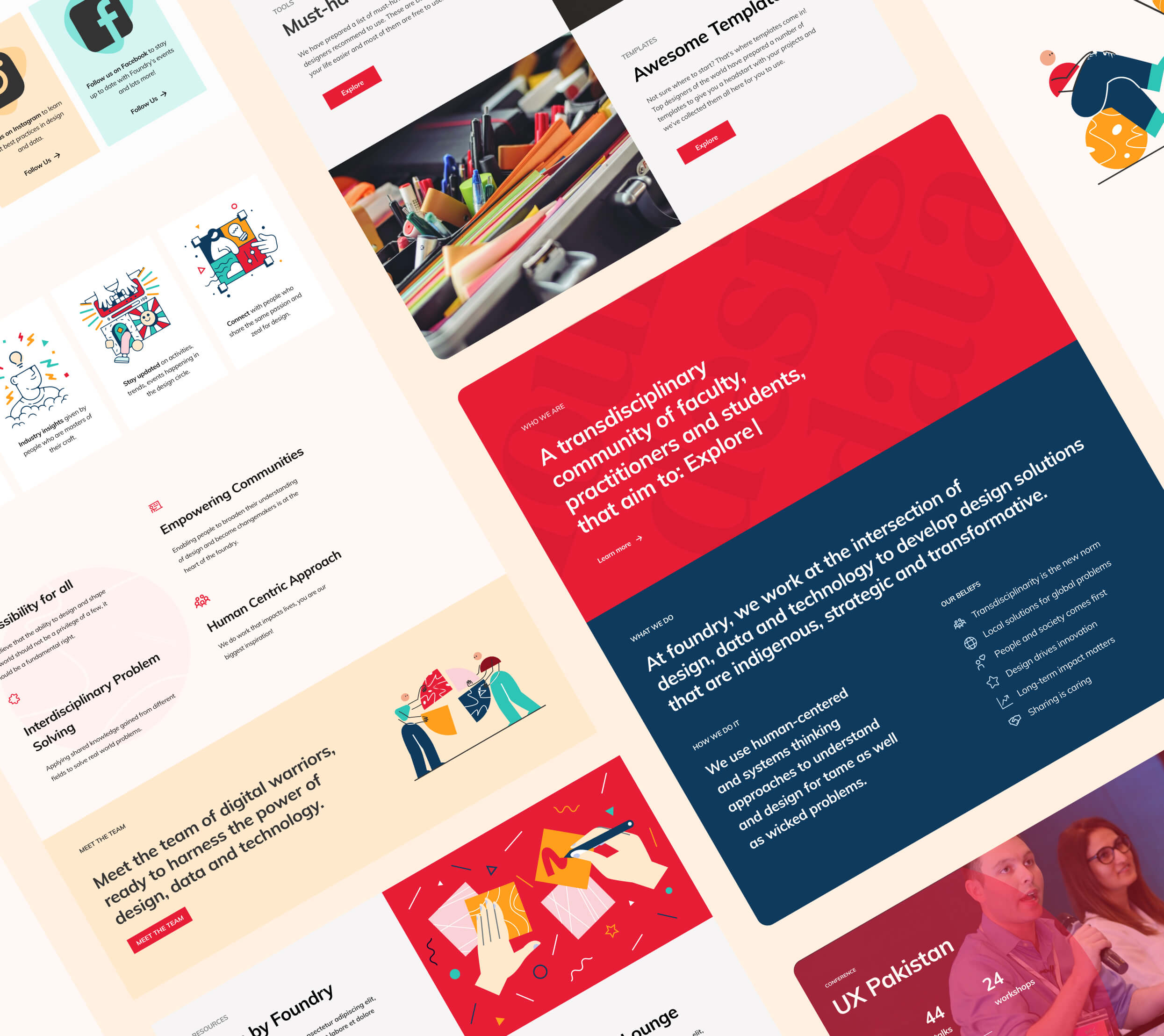
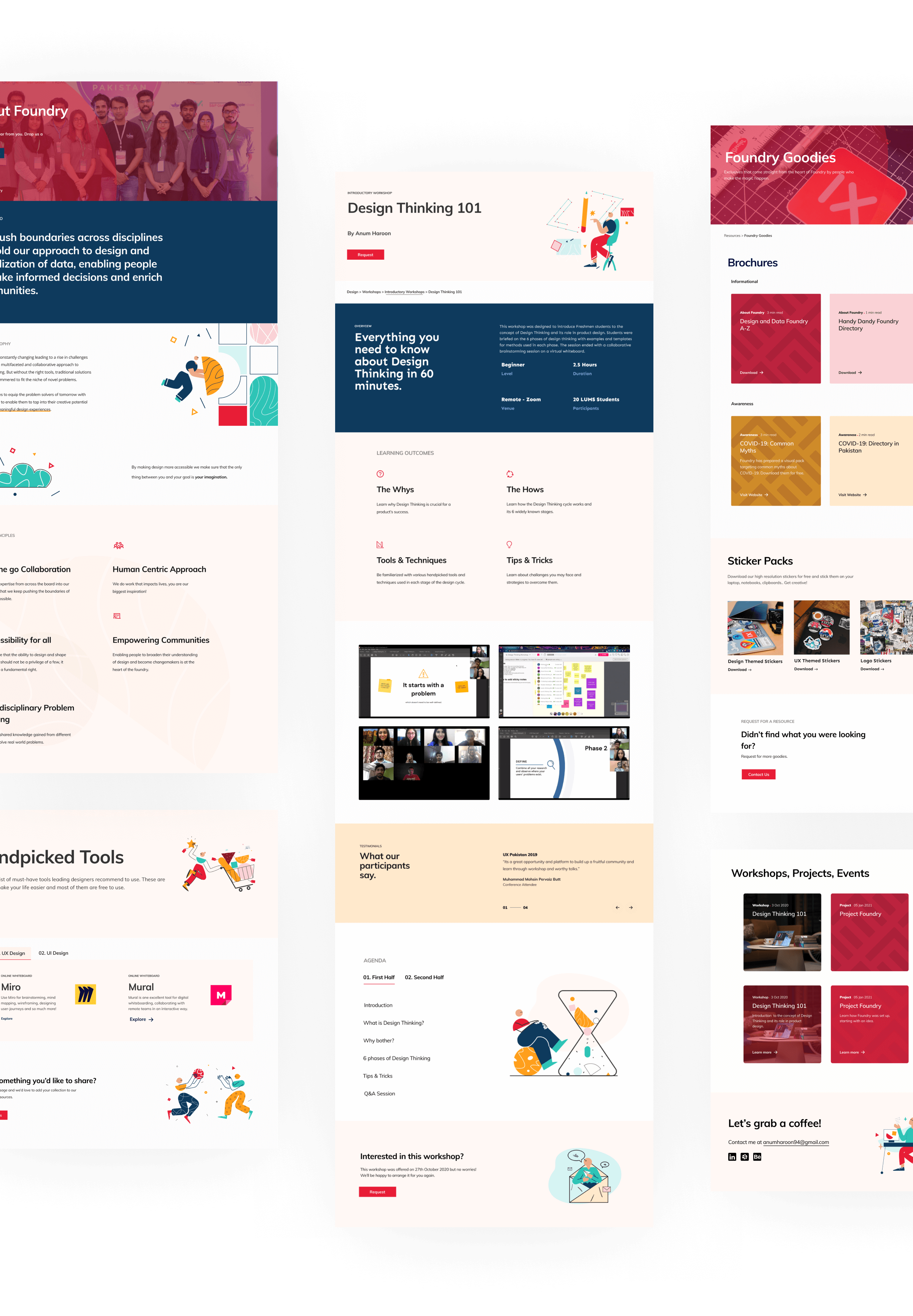
Once the high fidelity prototypes were ready, we coordinated with the engineering team using Slack and Trello. We closely worked with them to ensure the final output is pixel perfect.
To see the website in action, visit foundry.pk
LAUNCH PROJECT03. Supporting Initiatives
Design and Data Lounge
We wanted Foundry to be more than an initiative, we wanted it to be a movement. Our team aimed to promote the culture of virtual meetups, design and data discussions, design jams and so much more!
The global pandemic (COVID-19) did not stop us from achieving our goals. I pitched the idea of a Virtual Networking Lounge which was met with a lot of enthusiasm from the community.
We decided to create a exclusive group on Linkedin called Design and Data Lounge which was open to design and data enthusiasts in Pakistan who come from diverse backgrounds including Art, Design, Communications, Computer Science, Business, and Social Sciences. The idea behind the group was to foster meaningful communication among students and professionals.
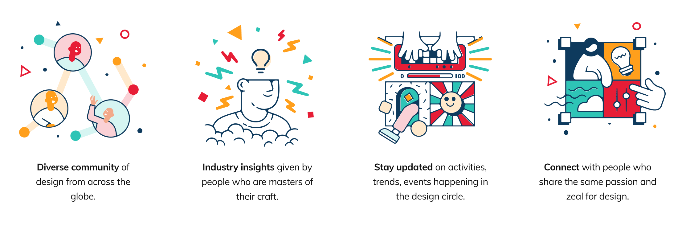

The team worked on some basic branding for the initiative, including the logo which is a combination of 2 D’s overlapping with the letter ‘F’, signifying that Design and Data Lounge is a Foundry-driven initiative.
Design & Data Lounge was a major success which grew to > 400 members within the first 3 weeks.
Feedback from the Design & Data Lounge community
Design Gupshup
In collaboration with Foundry, my teammates started a Discord Server called Design Gupshup (meaning ‘Design Conversations’ in Urdu).
Design Gupshup is a space for design enthusiasts to connect and have informal conversations about design. Within this community, there’s no such thing as ‘silly questions’ as we believe in growing together and lifting each other up.

04. Program Management
As a program manager, I was responsible for dealing with all top-level decisions including recruitment, finalizing events, forming an engagement strategy etc.
We launched Foundry on 28th April 2021 and my role shifted from being a Creative Director to a Program Manager. We received an overwhleming response from the community at the time of launch.
Feedback from the community right after launch
Bringing Foundry to life was only a small part of the big journey I was yet to embark upon.
I started off by forming a core team for which I conducted several interviews with students and professionals.
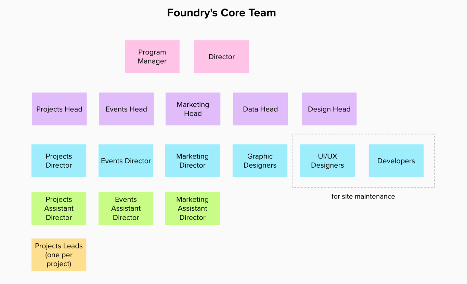
Forming Foundry’s Core Team
Following this, I created several engagement plans for Foundry for the first few months.
I realized that it’s cruical for Foundry to keep up with the hype, especially in the beginning, hence forming a tactful strategy was vital.
My team and I brainstromed for marketing and event ideas for the first 4-5 months. I then took over and created a tentative timeline for the upcoming events.
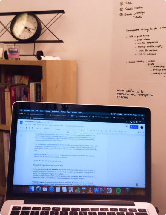
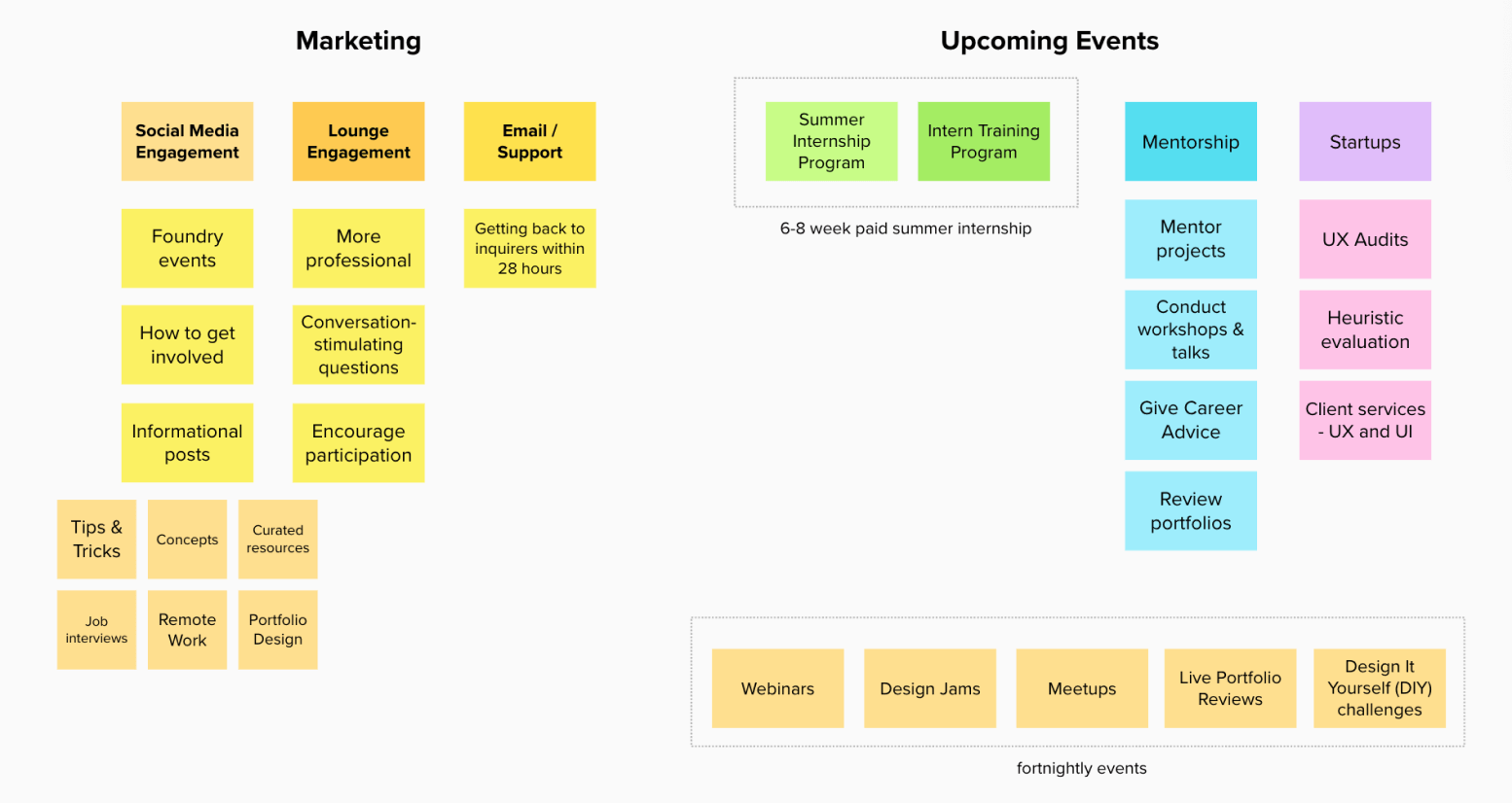
Marketing Strategy and Plan for Upcoming Events
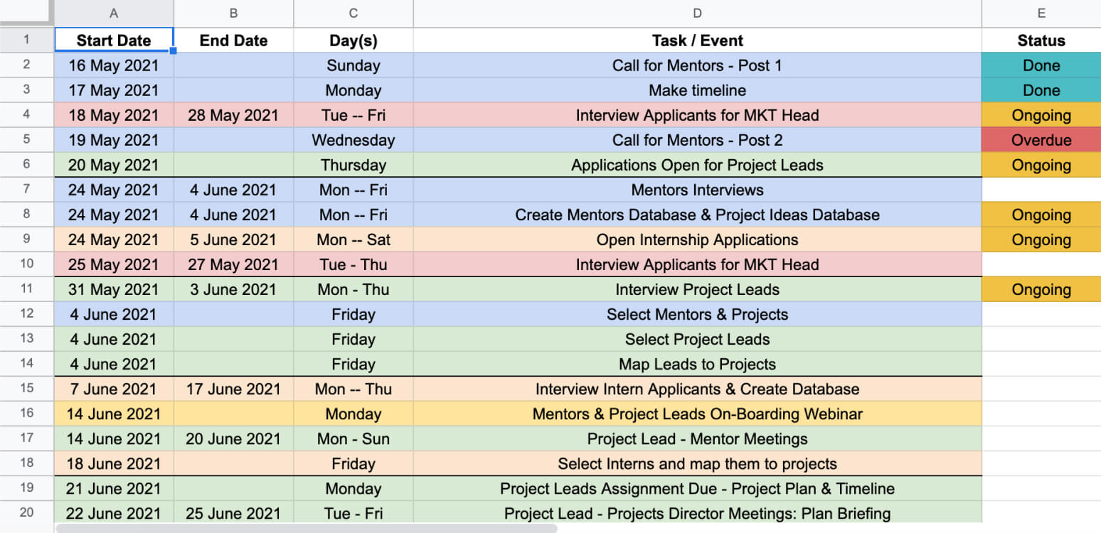
Timeline for initial events and engagement
Retrospective
Currently Foundry is being run according to plan by a talented group of students and professionals. I’m personally quite attached to this project because its vision aligns with my value to never stop learning.
I thoroughly enjoyed working on this project and got the opportunity to interact with incredibly talented people on the way. This project allowed me to come out of my shell and take full responsibility, including budget management, recruitment, helping individuals gain leadership skills and providing training to people from diverse backgrounds. I had to pull several all-nighters to make it happen, but in the end, it was so worth it!